Mapping beaches with the Data Science Accelerator Programme
The Data Science Accelerator Programme is an initiative run by the Government Digital Service (GDS), the Data Science Campus at the Office for National Statistics (ONS) and the Government Office for Science to help analysts from the public sector to develop their data science skills.
Since 2016, the UK Hydrographic Office (UKHO) has sent four analysts to the Data Science Campus to be mentored as part of the programme. They’ve worked on a range of projects, including the automated identification of objects in the sea. This has since been developed into a live system that has covered 881,280 square kilometres of ocean and uncovered 342 hazards that were unknown to the UKHO.
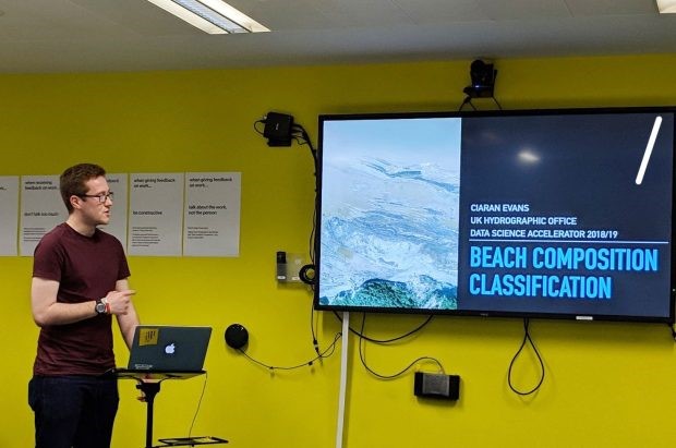
Ciaran Evans, a software engineer at the UKHO, is part of the latest cohort assigned to the Campus. He writes about his recent accelerator project.
The project
My project is officially titled, “Beach Composition Classification.” Scary, right? I like to pitch it more simply as: “What is the beach made of?”
As a software engineer at the UKHO, my day-to-day job involves solving problems all the time, but I wanted to solve something other than a continuous integration or deployment problem.
After asking around the organisation, I found a problem faced by our Defence Team, who are responsible for providing data and products to defence users, like the Royal Navy. Our defence users often require reports on the composition, content and general geography of a beach for exercise planning and execution.
Currently we provide information from open source data, such as Open Street Map and ground photography, but this can prove difficult when data are not available for certain areas. My project looked at how we could fill in these gaps and give our users new information on what a beach may contain.
Getting started
To deal with the lack of data, I first looked at the European Space Agency’s Sentinel 2 satellite imagery. This was too low a resolution (10 metres per pixel) for the problem, so I went to the Channel Coast Observatory (CCO). The CCO provides coastal aerial imagery of the English coast at 12.5 centimetres per pixel – far better for identifying what a beach is composed of.
I then needed to prepare this data for further analysis. To do this, I used Python (with a bunch of geospatial and raster packages) and QGIS. My process was:
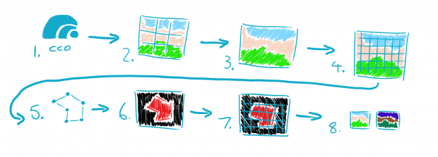
- visit the CCO website
- download the sections for the beach
- merge the cells together into one big image (my main training image was 40,000 x 20,000 pixels)
- split the image into 256 x 256 pixel cells (required for the model I used – this gave me over 12,000 images)
- draw spatially referenced vectors around the areas I said were sand
- rasterize the vectors (turn X and Y into pixels)
- split the sand image into 256 by 256-pixel cells
- normalise my images (to make the maths quicker)
Using deep learning
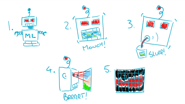
Next up came the fancy stuff – the deep learning! This is a machine learning technique that can be used to identify features from data including images, text or sound. So, by creating the right deep learning model, we’d be able to quickly identify sand from other geographic features in our aerial image.
The model I made was based on the U-Net architecture. The U-Net had been used previously on a project to identify mangroves in satellite imagery and it worked well. You can find out more in this post by UKHO data scientist Kari Dempsey.
The machine learning process goes like this:
- make your model
- feed it a bunch of data
- feed it even more data
- get it to classify your data
- enjoy the pictures it spits out
While this sounds straightforward, it involved a lot of picking apart of Python code and debugging confusing outputs, which gave me a newfound respect for what data scientists do!
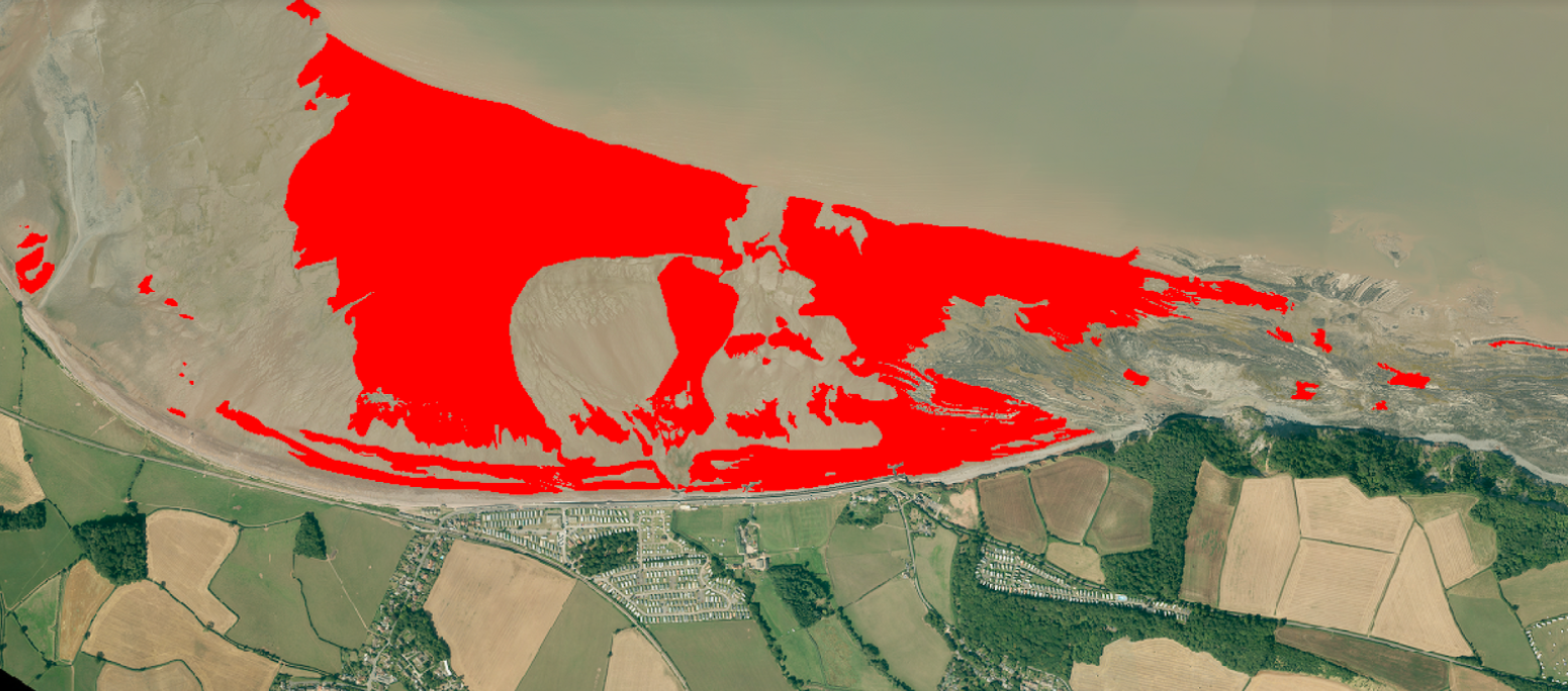
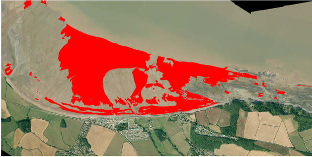
So, did it work?
The proof, they say, is in the pudding:
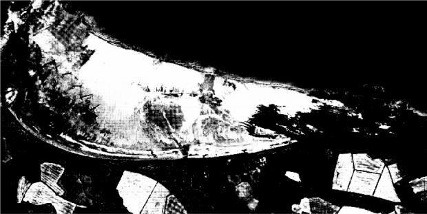
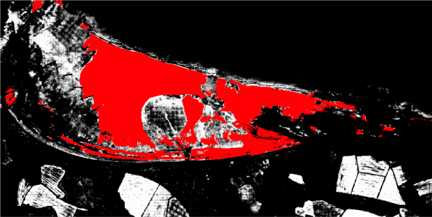
The first image shows what the model classified as sand (shown in white) and not-sand (shown in black). The second image shows the original label of what I determined was 100% sand overlaid on top.
I was very pleased with the initial results; the model was not completely off, and I could understand why it had classified fields as sand. These areas would ideally be masked/removed completely before classification. I was particularly impressed with the clear definition of sand and not-sand on the right-hand side, where there is a large rocky outcrop. With more work, this could be a great way of classifying beaches for our defence customers going forward.
Reflecting on the programme
I loved the whole experience of the Data Science Accelerator programme and learned more than I could fit in to a single blog post. It was nice to jump straight in at the deep end of deep learning, having already gained the programming knowledge from my day job. Not only did I get a better idea of what data scientists do day-to-day, but I now have a bigger appreciation for the work that is data preparation.
My mentors, Michael Hodge and Alex Noyvirt at the Data Science Campus were incredible, and happy to answer the many questions I had – even though I’m sure all the clicking from me drawing vectors was driving them to despair. It was also useful to have the UKHO experts on hand – Kari and the Data Science team had plenty of Skype messages from me throughout the 12 weeks.
The programme was a huge springboard into my new role at the UKHO; I’ll be moving on from software engineer to senior data engineer, harnessing Cloud technologies to process big data in pipelines, and productionising the work our Data Scientists do. The geospatial and Python skills I gained through the programme certainly made the interview less stressful!
So, if you’re looking for a challenge, I’d wholeheartedly recommend you apply to be a part of the next cohort. You don’t need any prior coding experience, just a willingness to learn and improve yourself!