Estimating vehicle and pedestrian activity from town and city traffic cameras
Updated 15 December 2021
We have refactored the open codebase to enable the Traffic Cameras project to run on a single, stand-alone laptop as well as on Google Cloud Platform. This is part of the ESSNet project, making the system more accessible to users who don’t have the infrastructure available to run it. A mid-range laptop (without specialist GPU) can now support in the order of 50 to 100 cameras; the updates section of this article has further details.
Published 3 September 2020
Understanding changing patterns in mobility and behaviour in real time has been a major focus of the government response to the coronavirus (COVID-19). The Data Science Campus has been exploring alternative data sources that might give insights on how to estimate levels of social distancing, and track the upturn of society and the economy as lockdown conditions are relaxed.
Traffic cameras are a widely and publicly available data source allowing transport professionals and the public to assess traffic flow in different parts of the country via the internet. The UK has thousands of publicly accessible traffic cameras, with providers ranging from national agencies to local authorities. These include:
- Highways England, who stream images from 1500 cameras located across the major road systems of England
- Traffic Wales
- Transport for London, with more than 900 cameras
- Reading Borough Council
The images traffic cameras produce are publicly available, low resolution, and are not designed to individually identify people or vehicles. They differ from CCTV used for public safety and law enforcement for Automatic Number Plate Recognition (ANPR) or for monitoring traffic speed.
In this article we:
- describe work using deep learning algorithms to detect pedestrians and vehicles from traffic cameras as a way of measuring how busy different towns and cities in the UK are
- discuss comparative analysis on the cost, speed and accuracy of different machine learning methods to achieve this; these include the Cascade Classifier, support vector machines, the Google Vision API, Faster-RCNN (PDF, 744KB) and YOLOv5
- present methods for cleaning faulty data and filtering static objects to improve reliability and accuracy in estimating people and vehicle movement from traffic cameras
Large volumes of image and video data from CCTV present significant challenges for deploying scalable platforms for computer vision and machine learning. We have built an end-to-end solution based on Google Cloud Platform with the necessary scalability and processing capability, and describe our approach in relation to data collection, modelling, and experimental research outputs.
This work could be helpful to public bodies in their ongoing response to the coronavirus as the country unlocks or local flare-ups emerge. It should also be of wider interest to local authorities to monitor issues such as:
- changing demand for local economies
- shifts in modes of transport for commuting
- environmental quality
- leveraging existing CCTV camera investments
Our pipeline is available for use in the open code repository.
The first experimental results from this novel data source have been published today as part of the Office for National Statistics’ (ONS’) Coronavirus and the latest indicators for the UK economy and society publication. Further updates will be published on a weekly basis.
1. Background
Extracting information from traffic cameras requires real-world entities to be recognised in the images and videos they capture. This is a popular topic in computer vision, particularly the field of object detection. Deep learning research has achieved great success in this task through the development of algorithms such as the YOLO series and Faster-RCNN (PDF, 744KB).
Researchers have applied these models to CCTV cameras to see if the data can be used to improve decision-making in coronavirus (COVID-19) policies. The Alan Turing Institute has worked with Greater London Authority (GLA) on Project Odysseus to assess activity in London before and after the lockdown. This project combines multiple data sources with varying spatio-temporal resolutions to provide a cohesive view of the city’s level of activity. These include JamCam cameras, traffic intersection monitors, point of sale counts, public transit activity metrics and aggregate GPS activity from the Turing’s London air quality project.
Newcastle University’s Urban Observatory team has worked on CCTV and Automatic Number Plate Recognition (ANPR) to measure traffic and pedestrians in the North East using the Faster Region based CNN (Faster-RCNN) model. Similarly, the Urban Big Data Centre at the University of Glasgow has explored using spare CCTV capability to monitor activity levels during the coronavirus pandemic on streets in Glasgow.
Work at Purdue University is using cameras from the internet to study responses to the coronavirus, where the vehicle and person detection is based on YOLOv3. A number of companies have also undertaken related work using their own networks of cameras.
Vivacity demonstrated the use of their commercial cameras and modelling to assess compliance with social distancing. Camera-derived data on retail footfall from Springboard has been used in the Office for National Statistics (ONS) as part of experimental data looking at the economic impacts of the coronavirus.
2. Data
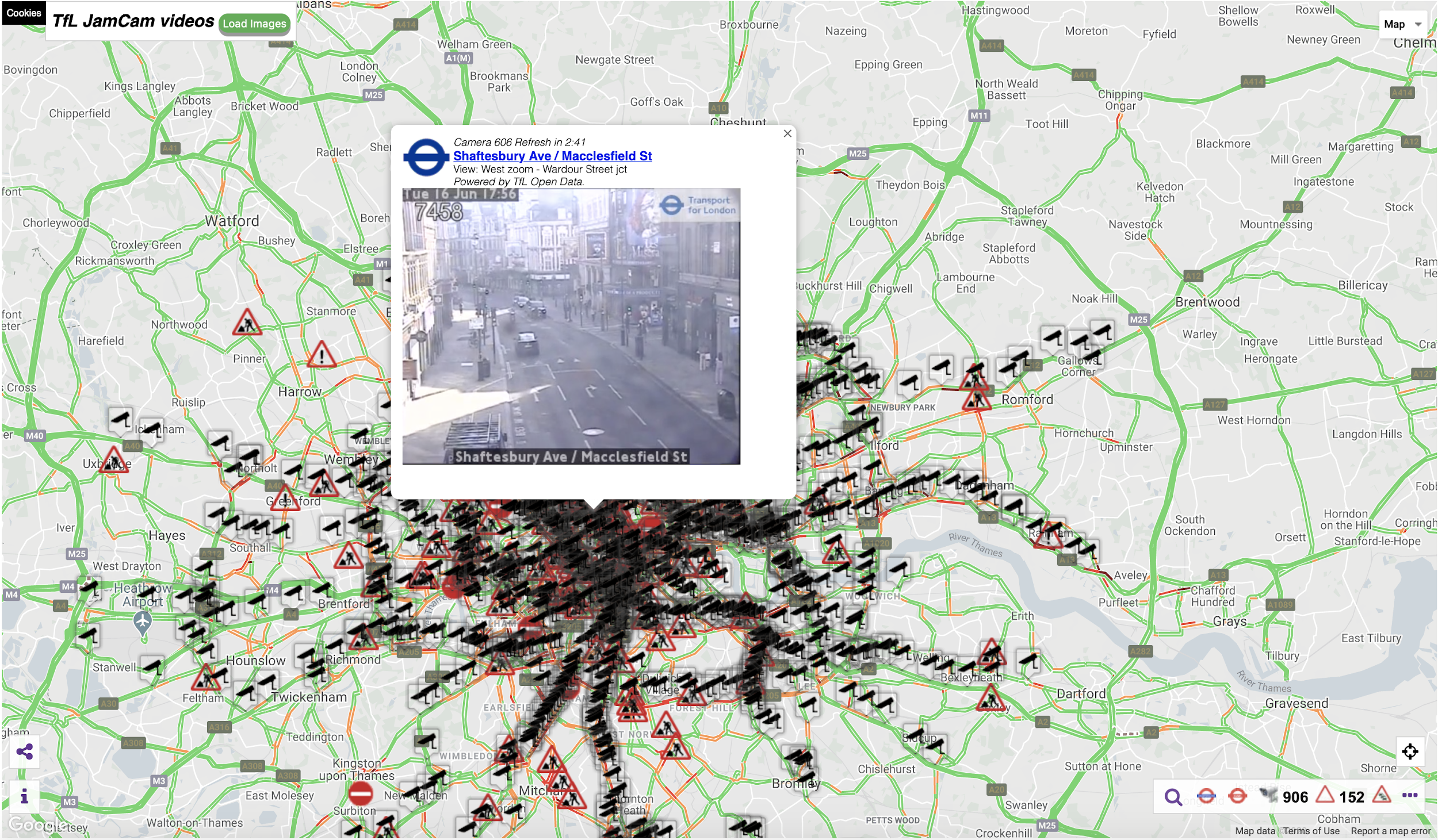
The UK has thousands of CCTV traffic cameras, particularly in major cities and towns. In London alone there are more than 1,000 cameras publicly accessible (see Figure 1 from JamCam).
Figure 1: London JamCam distributions
The open websites we have reviewed where camera images are publicly available are:
- Aberdeen
- Andover
- Bude
- Cinderford
- Dublin
- Durham
- Farnham
- Glasgow
- Kent
- Leeds
- London (TfL)
- Manchester (TfGM)
- North East
- Northern Ireland
- Nottingham
- Reading
- Sheffield
- Shropshire
- Southampton
- Southend
- Sunderland
- Wrexham
We selected a subset of sites from the list and have built up a profile of historical activity on their cameras. We selected:
- Durham (since 7 May 2020)
- London (11 March 2020)
- Manchester (17 April 2020)
- North East (1 March 2020)
- Northern Ireland (15 May 2020)
- Southend (7 May 2020)
- Reading (7 May 2020)
These locations give broad coverage across the UK while also representing a range of different-sized settlements in both urban and rural settings.
Camera selection
We were interested in measuring changes in how busy places were during the course of the coronavirus (COVID-19) pandemic (that is the trend of vehicle and pedestrian counts), rather than monitoring traffic flow. Not all cameras are useful for measuring this. Many cameras are focused on major trunk roads or located on country roads without a pavement.
To select cameras that were representative of the busyness of local populations, we manually tagged cameras if they contained certain features within the scenes they captured. We selected features that were easy to identify and would be likely to contain pedestrians or exclude them. Given all cameras are roadside, they will capture traffic, but may be in areas without pedestrians or cyclists and hence would not reflect overall busyness.
The features we tagged are shown in Figure 2.
Figure 2: Percentage of cameras having scene feature by provider
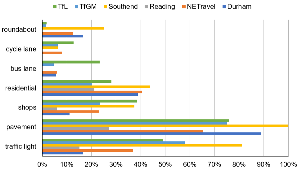
We applied a scoring mechanism to cameras based on these features to determine which were more likely to represent “busyness” in typical street scenes:
- shops: +5
- residential: +5
- pavement: +3
- cycle lane: +3
- bus lane: +1
- traffic lights: +1
- roundabout: -3
We looked to detect the busyness of local commercial and residential areas including both pedestrians and vehicles rather than purely traffic flow. The higher the total score, the more likely the cameras include both pedestrians and vehicles, hence we used the total score to determine if a camera would reflect general busyness. This enabled us to reduce the number of cameras we needed to process. We present the number of cameras against each score in Figure 3.
Figure 3: Number of cameras per total score
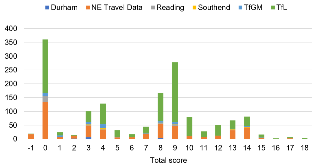
It is clear there are a large number of cameras from Transport for London (TfL) and North East (NE) travel data and so a naive selection of cameras by score would be dominated by these two providers. To enable a more refined comparison, the number of cameras is replaced with a percentage per provider and presented in Figure 4.
Figure 4: Percentage of cameras, normalised by provider, per total score
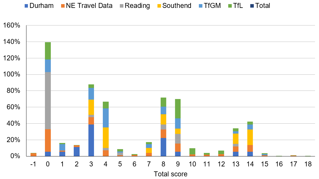
In percentage terms, total scores of eight and above are more evenly distributed among image providers than, for instance, totals of zero, three or four, so we have used that as a threshold to select cameras. This means the different geographic areas covered by providers have a reasonably consistent distribution of “street scene” types, but some areas have significantly more cameras than others (for example, TfL has 911 source cameras before filtering, compared with 16 for Reading).
To avoid one area overwhelming the contribution from another, we opted to keep each geographic area as a separate dataset. We investigated time series behaviour for each area independently to avoid the issue by producing an aggregate UK time series. An aggregate UK series is being considered as part of future work.
Annotation of images
Annotated data is critical to train and evaluate models. We have used an instance of the VGG Image Annotator (VIA) application to label our data, hosted courtesy of the UN Global Platform. We labelled seven categories: car, van, truck, bus, person, cyclist and motorcyclist. Figure 5 shows an interface of image annotation.
Figure 5: Interface of image annotation application
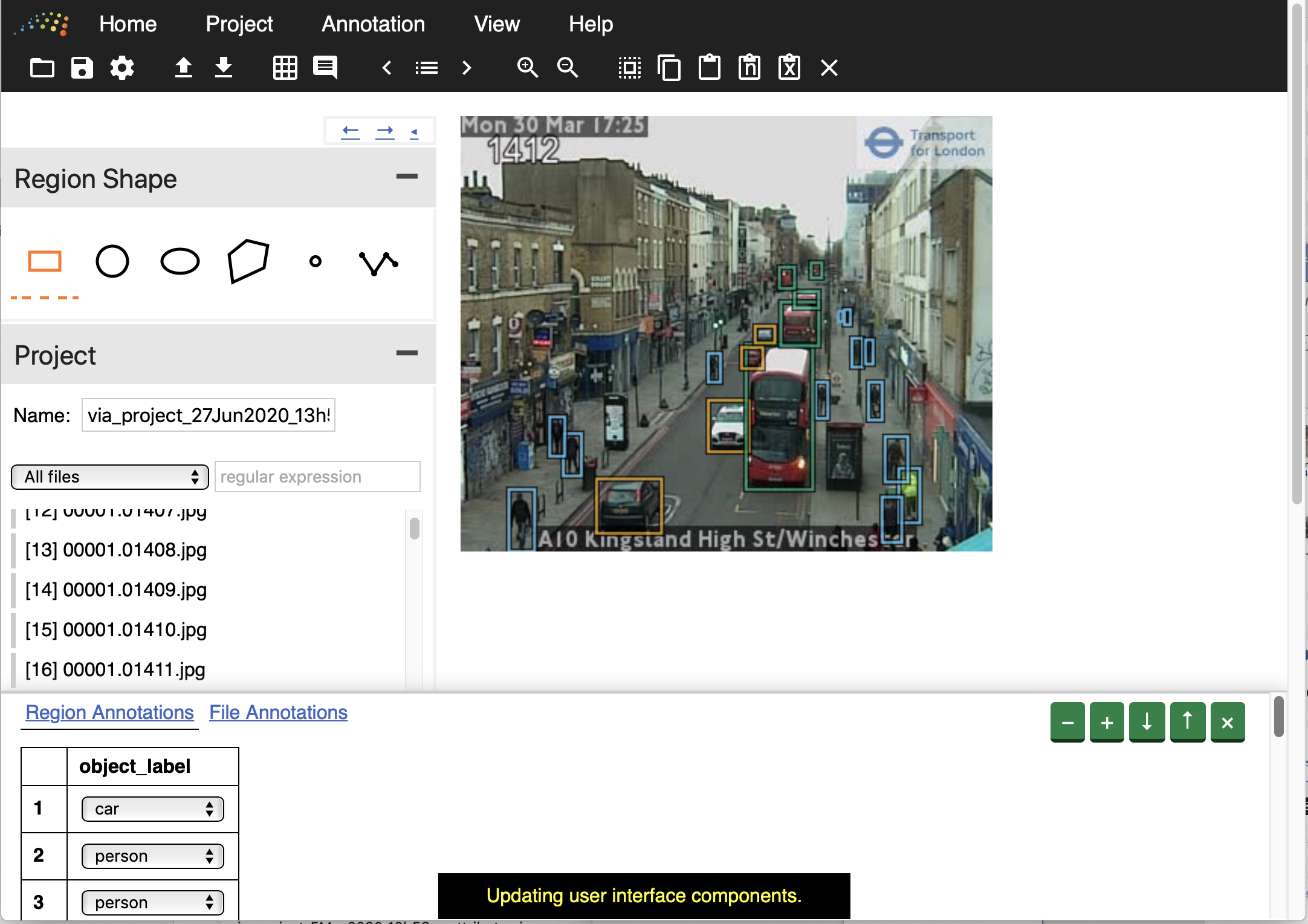
Footnote: Orange box: car, Blue box: person, Green box: bus
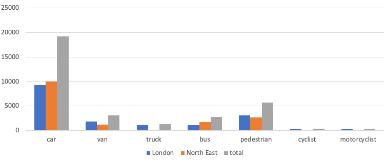
Two groups of volunteers from the Office for National Statistics (ONS) helped label approximately 4,000 images of London and the North East. One group labelled a randomly selected set of images without consideration of time of day; the other labelled randomly selected images but with an assigned time of day. Random selection helped to minimise the effect of bias on training and evaluation. We also wanted to evaluate the impact of different illumination levels, and so purposely stratified sampling by fixed time periods for some images.
Table 1 and Figure 6 present statistics on the labelled data. The distribution of labels is unbalanced. The use of unbalanced data in training is a challenge requiring further research.
Table 1: Counts of labels in the data
| images | car | van | truck | bus | pedestrian | cyclist | motorcyclist | |
| London | 1,950 | 9,278 | 1,814 | 1,124 | 1,098 | 3,083 | 311 | 243 |
| North East | 2,104 | 9,968 | 1,235 | 186 | 1,699 | 2,667 | 57 | 43 |
| total | 4,054 | 19,246 | 3,049 | 1,310 | 2,797 | 5,750 | 368 | 286 |
Figure 6: Counts of labels by object type
3. Processing pipeline: architecture
A processing pipeline was developed to gather images and apply models to detect pedestrians and vehicle numbers. To meet requirements for 24 hours a day, seven days a week uptime and manage large quantities of data, the solution pipeline was developed in the cloud. This has several advantages:
- machine maintenance is provided
- security support is provided, especially with remote working
- large data storage is easily available
- on-demand scalable compute is available, which is useful when testing models and processing large batches of imagery
Code in the pipeline is run in “bursts”; because cloud computing is only charged when used, this is a potential saving in compute costs. Our overall architecture is presented in Figure 7.
Figure 7: High-level architecture of the system
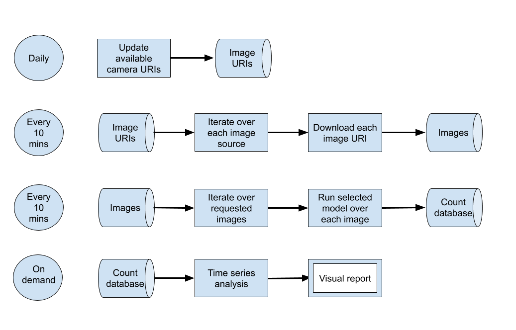
This architecture can be mapped to a single machine or a cloud system; we opted to use Google Compute Platform (GCP), but other platforms such as Amazon Web Services (AWS) or Microsoft’s Azure would provide relatively equivalent services.
The system is hosted as “cloud functions”, which are stand-alone, stateless code that can be called repeatedly without causing corruption – a key consideration to increase the robustness of the functions. The daily and “every 10 minutes” processing bursts are orchestrated using GCP’s Scheduler to trigger a GCP Pub/Sub Topic according to the desired schedule. GCP cloud functions are registered against the topic and are started whenever the topic is triggered.
A major advantage occurs when we make multiple requests to a cloud function. If it is busy servicing a request, and sufficient demand occurs, another instance will be spun up automatically to take up the load. We are not charged specifically for these instances. Charges are for seconds of compute used and memory allocated. Hence, running 100 instances to perform a task costs little more than running a single instance 100 times.
This on-demand scalability enables the image downloading code to take advantage of GCP’s internet bandwidth. Over a thousand images can be downloaded in under a minute and it can easily scale to tens of thousands of images. To cope with a potentially enormous quantity of imagery, buckets are used to store the data – these are named file storage locations within GCP that are secure and allocated to the project. This enables sharing between authorised users.
Processing the images to detect cars and pedestrians results in counts of objects being written into a database for later analysis as a time series. The database is used to share data between the data collection and time series analysis, reducing coupling. We use BigQuery as our database given its wide support in other GCP products, such as Data Studio for data visualisation.
The time series analysis, by comparison, is a compute-intensive process taking hours to run due to imputation overhead (described in Section 5). This is hosted on a Virtual Machine instance within Google Compute Engine, and is processed weekly.
The system is highly flexible. It does not assume imagery, merely a data processing pipeline where data is fed into filters and processing models to eventually generate object counts. For instance, the input data could be audio files where we are looking to detect signals, or text reports for key phrases or themes.
4. Deep learning model
Figure 8 describes the modelling process. The data flow shown in green processes spatial information from a single image. That is, each image is processed independently without considering other images captured before or after it. The blue flow processes spatial and temporal information for an image and its most recent neighbouring images. The data cleaning step uses temporal information to test if an image is duplicated. It also uses spatial information to check for image faults. The object detection step uses spatial information to identify objects in a single image. The static mask step then uses temporal information on objects detected over a sequence of images to determine whether they are static or moving.
Figure 8: Data flow of the modelling part
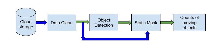
Footnote: Green arrow: data with spatial information, Blue arrow: data with both spatial and temporal information.
Data cleaning
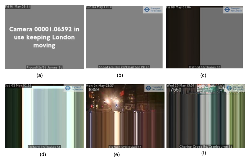
Ideally, new images are fetched every 10 minutes from cameras, for example by API or from Amazon real-time storage. However, in practice, images can be duplicated if the host did not update them in time. Cameras can be periodically offline and display dummy images. Images can also be partly or completely distorted because of physical problems with a camera. Some examples of problematic images are shown in Figure 9. These types of images will have an impact on counts. Data cleaning is therefore an important part to improve the quality of statistical outputs.
By examining images from JamCam and North East traffic, we found two common characteristics of “faulty” images:
- large connected areas consisting of different levels of pure grey (R=G=B) (Figure 9, a to c)
- horizontal rows repeated in whole or part of the image (Figure 9, d to f)
Figure 9: Problematic images from different cameras
To deal with the first issue, we subsample the colours used in the image to detect if a single colour covers more than a defined threshold area. We found that sampling every fourth pixel both horizontally and vertically (one-sixteenth of the image) gave sufficient coverage; further down-sampling pixels from 256 levels to 32 levels in each of red, green and blue was sensitive enough to correctly detect all “artificial” images where a single colour covered more than 33% of an image.
For the second situation, we use a simple check to determine if consecutive rows contain a near-identical sequence of pixels (allowing for variation resulting from compression artefacts). If a significant portion of the image contains such identical rows, we mark the image as “faulty”.
Object detection
Object detection is used to locate and classify semantic objects within an image. We experimented using different models for detection, including the Cascade Classifier, Support Vector Machines, the Google Vision API, and Faster-RCNN (PDF, 744KB). We disregarded the first two methods because of their disappointing accuracy. Table 2 shows a comparison between Google vision API and Faster-RCNN. We selected the Faster-RCNN model over the Google Vision API because of its faster speed, lower cost and performance quality. We are continuing to investigate the latest deep learning algorithms, such as YOLOv5 and ensemble method.
Table 2: Comparison of Google Vision API and the Faster-RCNN
| Google Vision API | Faster-RCNN | |
| Speed | 109ms per image (GPU settings unknown) | 35ms per image on a NVIDIA Tesla T4 |
| Accuracy (Figures 11 and 12) | Low | High |
| Relative cost | High | Low |
| Improvement | Cannot retrain or fine-tune unless Google upgrades the API | Can improve the model by re-training or fine-tuning |
| Categories detected | The Google Vision API does not provide a full list, but it claims millions of predefined categories | Seven categories trained (can add more categories by transfer-training or retraining) |
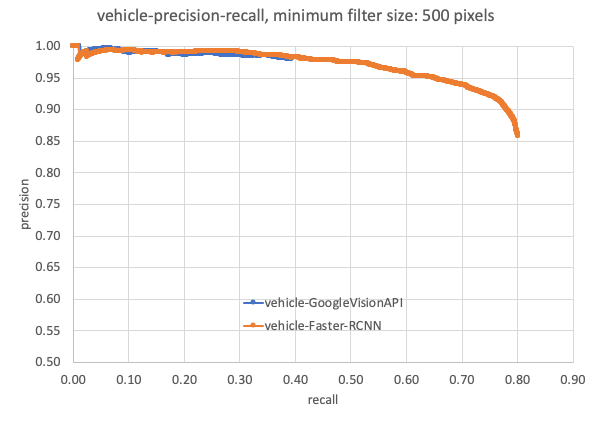
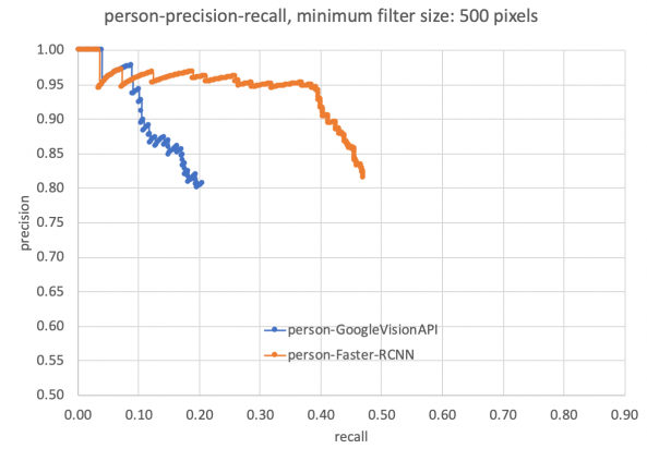
Figure 10 visually compares results from Faster-RCNN against Google Vision API. A detailed comparison of performance quality is given in Figures 11 and 12. The evaluation dataset is detailed in Table 3. As the GoogleVision API does not identify any cyclist and only detected two motorcycles from this dataset, we have not included cyclists or motorcycles in our comparison. We can see that the Faster-RCNN has achieved better mean average precision (mAP) and precision-recall compared with the Google Vision API.
Figure 10: Outputs from Google Vision API and Faster-RCNN
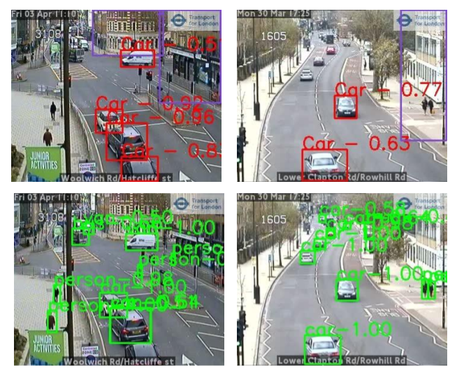
Footnote: Top: from Google Vision API, Bottom: from Faster-RCNN. The number is the confidence score associated with detected objects.
Table 3: Evaluation dataset
| Number | |
| Images from JamCam London (daytime) | 1,700 |
| Car | 8,570 |
| Bus | 958 |
| Truck | 1,044 |
| Van | 1,593 |
| Person | 2,879 |
| Cyclist | 281 |
| Motorcyclist | 219 |
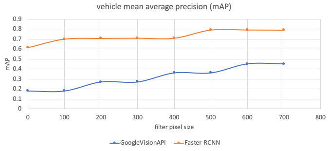
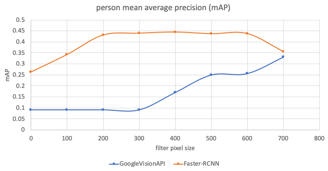
During evaluation, we noticed that the Google Vision API struggled with small objects, so when we calculated the metrics, we also considered the number of pixels in labelled objects. For example, in Figure 11, 0 means that the testing set includes all sizes of objects, 100 means that the testing set excludes any objects smaller than 100 pixels, and so on. We can see that the Google Vision API achieves faster increase of mean average precision (mAP) the bigger the object size.
Figure 11: Performance comparison (mAP) between the Faster-RCNN and Google Vision API
-
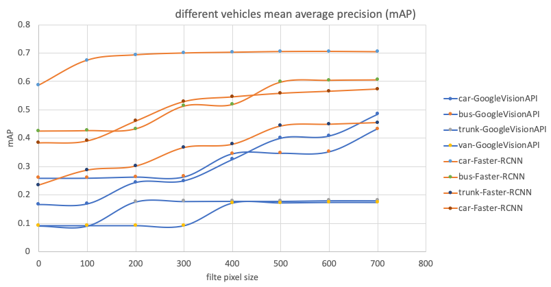
- mAP: mean average precision X axis: the object size filter. 0: no filter, 100: filter any objects under 100 pixels and so on
Figure 12 presents precision-recall curves. The Faster-RCNN showed higher recall against the Google Vision API, and thus higher potential to improve through fine-tuning.
Figure 12: Precision-recall comparison
Static mask
The object detection process identifies both static and moving objects. As we are aiming to detect activity, it is important to filter out static objects using temporal information. The images are sampled at 10-minute intervals, so traditional methods for background detection in video, such as mixture of Gaussians, are not suitable. We use structure similarity (SSIM) to extract the background. SSIM is a perception-based model that perceives changes in structural information. SSIM is not suitable to build up background or foreground with continuous video because changes between two sequential frames in a very short period – 40 milliseconds (ms) for 25 frames per second (fps) progressive videos – are too subtle. For a 10-minute interval though, SSIM has enough information to perceive visual changes within structural patterns.
Any pedestrians and vehicles classified during object detection will be set as static and removed from the final counts if they also appear in the background. Figure 13 gives results of the static mask, where the parked cars in Figure 13a are identified as static and removed. An extra benefit is that the static mask can help remove false alarms. For example, in Figure 13b, the rubbish bin is misidentified as a pedestrian in the object detection but filtered out as a static background.
Figure 13: Results of the static mask
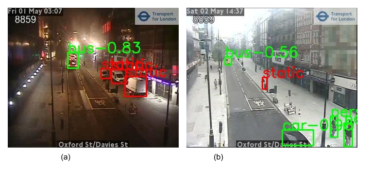
Footnote: Green bounding boxes: moving objects, Red bounding boxes: static objects.
Validation of time series
Although mean average precision and precision-recall measure the model’s accuracy against labelled images, it is important to also check the coherence of results against other sources. We have used the traffic counts from Automatic Number Plate Recognition (ANPR) data obtained from Newcastle University’s Urban Observatory project and Tyne and Wear UTMC as ground truth to compare against.
ANPR traffic counts are defined on segments with camera pairs, where a vehicle count is registered if the same number plate is recorded at both ends of the segment. This has the side effect of not including vehicles that turn off onto a different road before they reach the second camera; such vehicles would appear in traffic camera images, and so counts may not be entirely consistent between the two sources if this happens often. To this end, we identified short ANPR segments that also contained traffic cameras; an example is presented in Figure 14. The Faster-RCNN model is then used to generate traffic counts from these cameras to be compared against the ANPR data.
Figure 14: Jupyter notebook using Folium, showing ANPR segments with nearby CCTV for review and selection
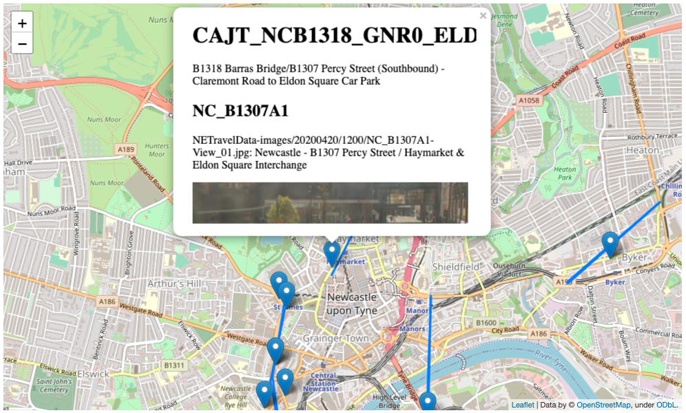
Figure 15 compares time series from ANPR and the Faster-RCNN model (with and without the static mask). The Pearson correlations coefficients are given in Table 4. To note, the vehicle count is calculated every 10 minutes and the middle dashed red line indicates the first day of lockdown (24 March 2020). To harmonise the rate at which the two methods capture vehicles, the ANPR count is downscaled by 20. This assumes a CCTV image covers a stretch of road that would take 30 seconds (s) for a car to travel along. Since the CCTV only samples every 10 minutes (600s), we assume we have captured 30s out of the 600s that the ANPR will have recorded, that is one-twentieth.
Figure 15: Comparison of the time series produced from ANPR and traffic cameras (CCTV)
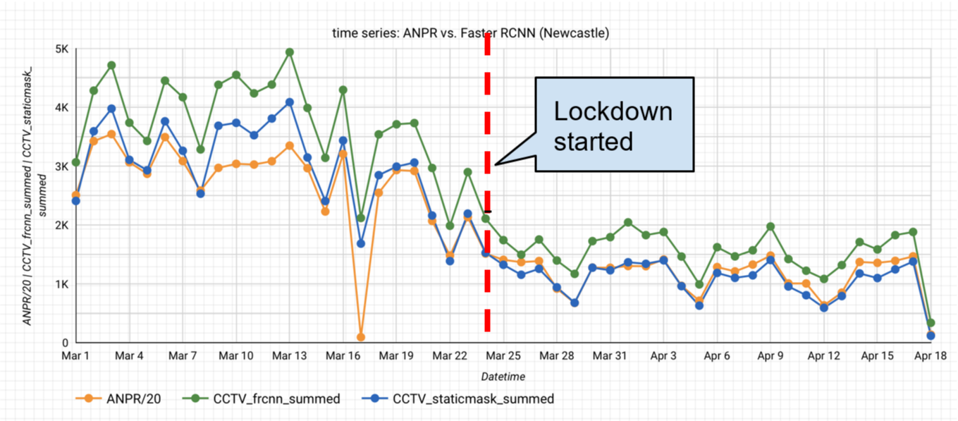
Table 4: Pearson correlations coefficients
| Pearson correlation | Faster-RCNN | Faster-RCNN+static mask |
| ANPR | 0.96 | 0.96 |
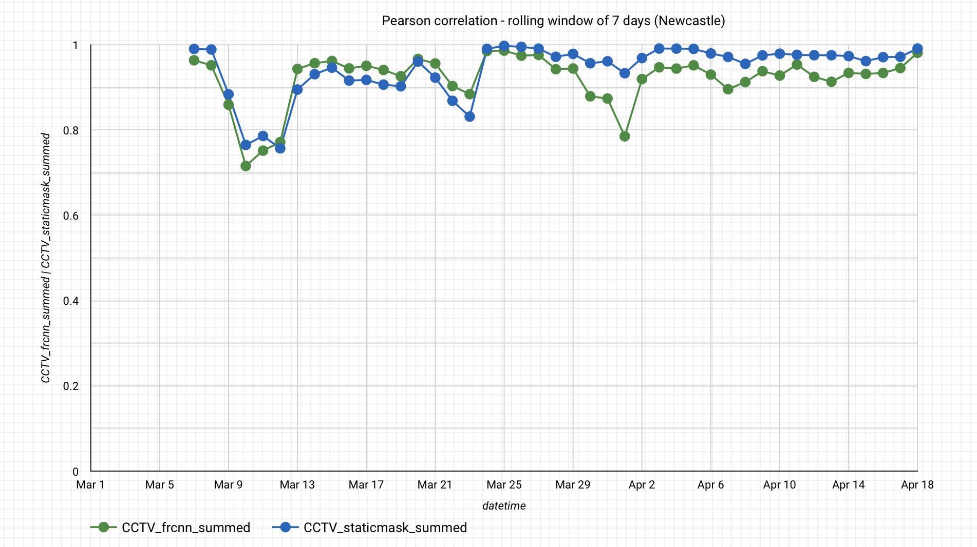
Figure 16 compares correlation coefficients for the time series calculated over a rolling seven-day window. The series are nearly the same for the period of 1 March to 18 April 2020, with or without the static mask, though the static mask shows less variation. The average of these local Pearson correlations is 0.92 for Faster-RCNN and 0.94 for Faster-RCNN+static mask. As further work, we intend to also compare the traffic camera outputs with data from SCOOT loop traffic counters.
Figure 16: Pearson correlation with the rolling window of seven days
5. Statistics
Interpreting the raw data would lead to a number of issues. In some places, data are missing and therefore incomplete. There may be systematic calendar-related variation in the data. Missing data need to be compensated for as this can create problems for analysis. Likewise, seasonally adjusting the data allows comparison between consecutive time periods and understanding of underlying trends in the data. Adjusting the raw data improves the robustness of the statistics and allows comparisons to be made across different time periods and locations (as all camera sources are adjusted using the same methods). This section explains in detail the adjustments applied to the raw data in order to arrive at the output statistics.
The time series data received from BigQuery are in 10-minute intervals. After performing the methods described in this section, it was evident that there was a general low occurrence of cyclists and motorcyclists, which resulted in unreliable seasonal adjusted output. As a result, cyclists were aggregated with pedestrians, and motorcyclists with cars.
Table 5 shows the total number of images for each location and source along with the number of missing and faulty images. These numbers reflected the state of the data on 21 July 2020, noting that the camera sources are a subset of those presented in the data section.
Table 5: Total number of images including missing and faulty images, 21 July 2020
| Location/Source | Total Images | Missing | Faulty |
| London (TfL) | 9,146,668 | 177,924 | 378,574 |
| North East | 3,863,753 | 781,006 | 5,774 |
| Reading | 62,256 | 1,365 | 2,853 |
| Durham | 62,496 | 1,301 | 11,236 |
| Manchester (TfGM) | 247,285 | 4,385 | 33,707 |
| Southend | 71,424 | 1,431 | 43,384 |
| Northern Ireland | 31,062 | 706 | 8,903 |
Imputation
Traffic cameras need maintenance; their views may become blocked and there may be periods of downtime, which results in missing data (NAs). The problem of missing data is well known and there are many algorithms to combat it. Most standard techniques rely on inter-attribute correlations. This is fine for multivariate time series imputation, but for this univariate time series, imputation needs to utilise time dependencies.
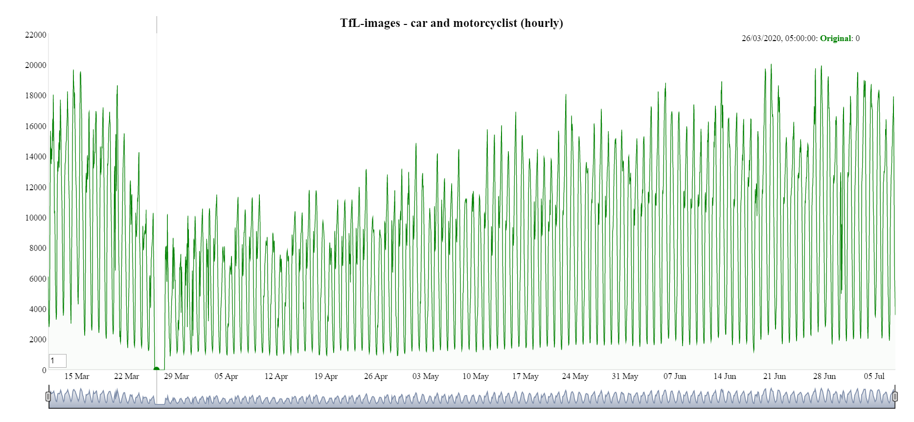
A break in the time series for Transport for London (TfL) can be seen in Figure 17 occurring from approximately 25 March to 27 March 2020. Leaving these data as missing would create problems for analysing data and performing seasonal adjustment algorithms.
Figure 17: Hourly TfL time series without imputation for car and motorcyclists
The package imputeTS is the only package available on CRAN that solely focuses on univariate time series imputation. This was used to perform imputation for missing/faulty camera images.
The imputation method used in this project was seasonally decomposed missing value imputation. This performs a seasonal decomposition operation as a preprocessing step. Imputation by mean value is then performed on the de-seasonalised series after which the seasonal component is added again. Other missing value imputation methods were tested, such as imputation by interpolation, last observation carried forward, and Kalman Smoothing and State Space Models. However, these yielded less satisfactory results and in the case of imputation by Kalman, the compute time was significantly longer and unfeasible.
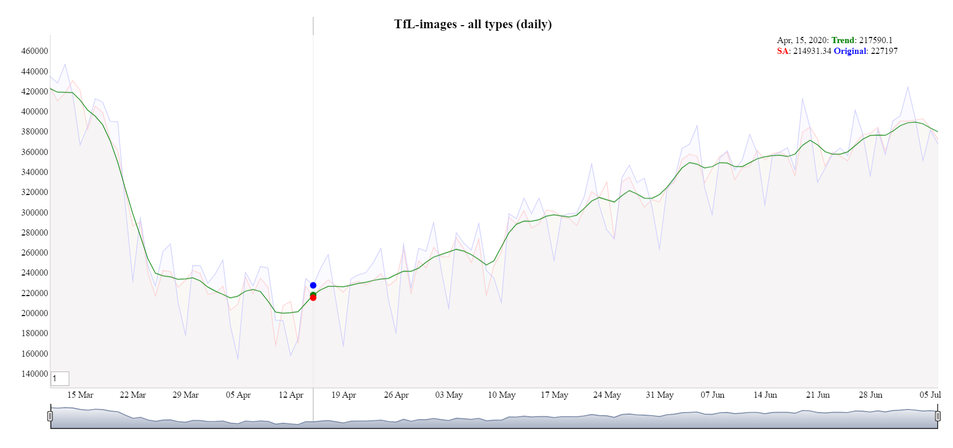
Imputation was carried out per traffic type (car, bus, pedestrian, and so on) per camera. Each location was imputed separately. Figure 18 shows TfL data after imputation with the break in the time series now gone.
Figure 18: Hourly TfL time series with imputation for car and motorcyclists
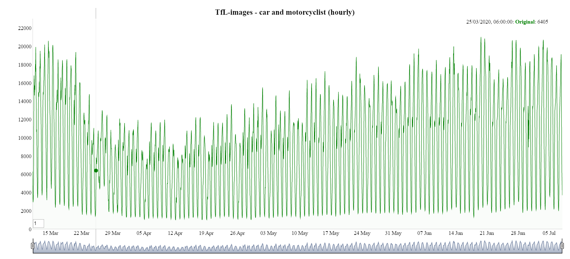
Figure 19 shows the distributions of missing values for an example TfL camera (id 00001.03705 from TfL-images). The whole time series of car counts is plotted and the background coloured red whenever a missing value is detected. There is a high concentration of missing values at approximately 13% time lapse in the time series. This includes the previously mentioned approximate two-day period where all TfL cameras were unavailable.
Figure 19: Distribution of missing values for TfL camera 00001.03705 for cars
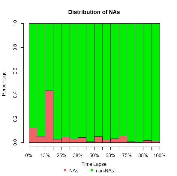
Figure 20 describes counts for missing images (NAs) classified according to the length of sequence in which the missing images occur – the gap size. Generally, missing images are more frequently found in smaller sized gaps, representing short intermittent outages of data. We do also encounter a small number of large-sized gaps (for example, of 208, 42, and 31 missing images in a row), suggesting times when the camera is temporarily out of service.
Figure 20: Ranked occurrence of gap sizes for TfL camera 0000.03705, cars
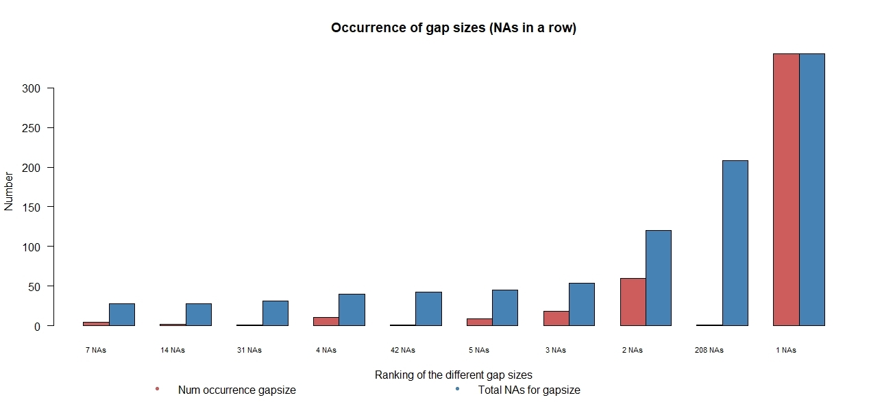
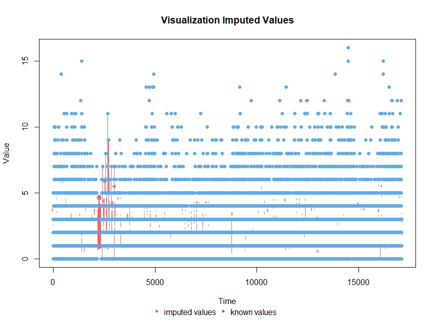
Figure 21 visualises the imputed values for an example camera after performing seasonal decomposed missing value imputation with imputation by mean value
Figure 21: Visualisation of imputed values for TfL camera 00001.03705
Seasonally adjusted time series
Once all missing values have been imputed, the time series needs to be seasonally adjusted in order to arrive at the final statistics.
Seasonal adjustment is fundamental for the analysis and interpretation of time series and is the process of estimating a seasonally fluctuating component of the series and then removing it. This leads to a clearer illustration of the underlying trend and movement of the series, making it easier to assess whether the observed movements are higher or lower than those expected for that particular day and time. Seasonal adjustment can help by smoothing out the variability that is only the result of seasonality (time of the year or calendar holidays).
Hourly and daily time series (seasonally adjusted, trend and original) are produced using Time Series Regression with ARIMA noise, Missing observations and Outliers/Signal Extraction of ARIMA Time Series (TRAMO/SEATS) once the data have been modelled and validated. TRAMO/SEATS is a procedure that extracts the trend-cycle, seasonal, irregular and certain transitory components of high frequency time series via ARIMA model-based method (see Handbook on Seasonal Adjustment (2018 edition) for more details).
The source data showing the number of different vehicle types and pedestrians detected in a 10-minute interval are first aggregated into an hourly series. This hourly series is then fitted to a seasonal ARIMA model with seasonal periodicity reflecting 24 hours in a day and 24 times seven hours in a week. These periods were chosen because of there being observed fluctuations in the data that relate to the time of day and day of the week. For example, we expect rush hours to appear in vehicle traffic during weekdays at specific times, but not during weekends, and the seasonal adjustment method allows us to take this into account when making comparisons. For daily time series, the data were aggregated to the day of occurrence, and fit with the seasonal period reflecting seven days in a week.
For both hourly and daily time series, the presence of different types of outliers is tested during this step to ensure that these do not distort the estimation when it is decomposed into trend, seasonal, and irregular components, where:
- trend expresses the long-term progression of the time series
- the seasonal component reflects level shifts, that is, common patterns that repeat within the same period
- the irregular components (which are the residuals after the other components) have been removed from the time series
Each location is processed separately and starting dates vary per location based on the start time discussed in Section 2. There are other seasonal frequencies and other calendar effects that could have been used however as our series are not long enough to detect them they weren’t implemented. For example, calendar effects like holidays are best detected with a few years’ worth of data.
Figure 22 displays the time series for hourly TfL images for all traffic and pedestrian types. Overall, the seasonal adjustment time series (red line) follows a similar path to the original data minus the large fluctuations. However smaller fluctuations in the data are still present, these could be due to bank holidays or coronavirus related legislation. Figure 23 shows the seasonally adjusted daily time series. The daily series shows a similar, but smoother, pattern than the hourly series.
Figure 22: Hourly TfL images seasonal adjustment (red line)
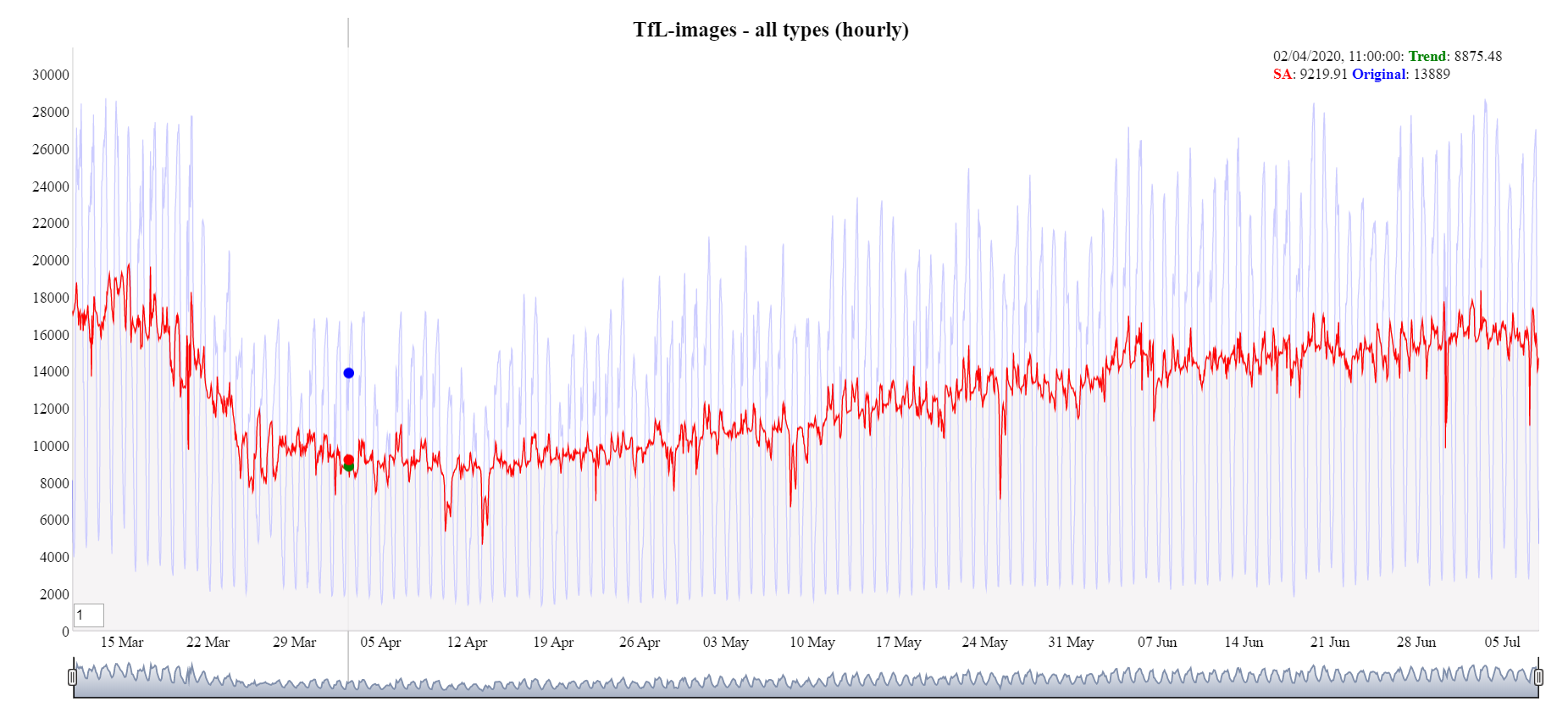
Figure 23: Daily TfL images trend (green line)
Treatment of negative seasonally adjusted values
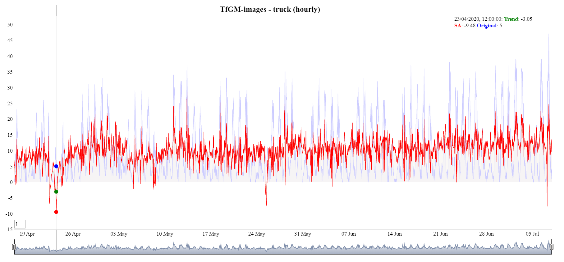
On inspection of the output following TRAMO/SEATS, the seasonal adjustment went negative. This was most obvious when the observations of a particular traffic and/or pedestrian type are close to zero. This is a problem often found in time series with strong seasonal movements. Adjustments were required to eliminate this issue as traffic counts are a non-negative time series.
Most time series are non-negative, showing variations which increase as the level of the series increases and therefore cannot be subject to additive errors of constant variance. Such effects are most noticeable if there are observations both close to, and far from zero, as it frequently happens in real time series with strong seasonal movements. This problem can be seen in Figure 24.
Figure 24: Hourly TfGM images, truck, seasonal adjustment goes negative
Applying a transformation to the response data, then performing TRAMO/SEATS on the transformed data and finally reversing the transformation can sometimes be effective in treating this problem. In addition, using a transformation often improves the analysis of time series data.
Initially, adding a small constant (ensure there are no zeros) and taking a log transformation was tried, however, it did not work well in this context and led to some questionable seasonal adjustment data. A square root transformation led to favourable results, as shown in Figure 25, where the negative seasonal adjustment is no longer present, and the same pattern is retained.
Figure 25: Hourly TfGM-images, truck, square root transformation applied
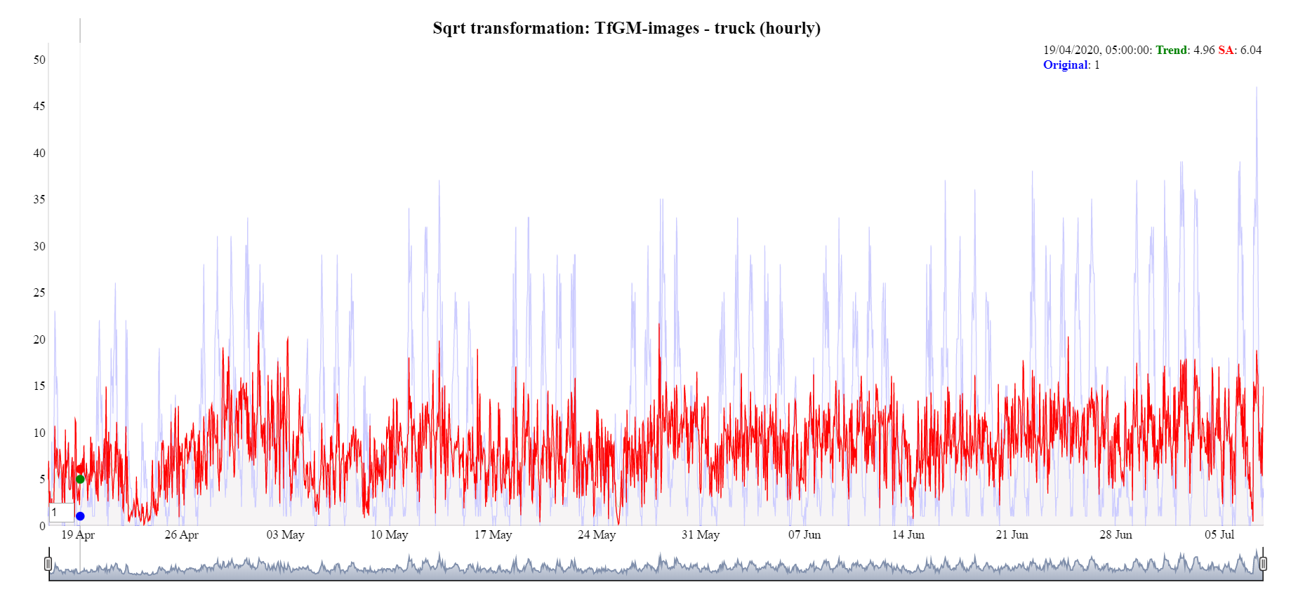
Transforming the data can introduce a bias with the back transformation. Accounting for the bias is currently being researched and implemented using the guidance from the Handbook on Seasonal Adjustment (2018 edition).
6. Conclusions
Traffic camera data can offer tremendous value to public authorities by providing real-time statistics to monitor the busyness of local populations. This can inform policy interventions such as those seen during the coronavirus (COVID-19) pandemic.
The traffic camera data is best suited at detecting trends in ‘busyness’ or activity in town and city centres. It is not suited for estimating the overall amount of vehicle or pedestrian movements, or for understanding the journeys that are made. It provides high frequency (hourly) and timely (weekly) data, which can help to detect trends and inflection points in social behaviour. As such, it provides insights that complement mobility and transport data where other mobility data and traffic data do not cover or are not openly accessible given this level of temporal granularity or immediacy. For example, Google Covid-19 mobility data is aggregated from users who have turned on the local history setting; Highways England covers motorways and A-roads.
There are a number of strengths to the analysis of traffic camera data:
- The data are very timely. We can process data up to the day prior, and we can produce these every week. If needed, the process can be scaled in order to produce more frequent time series, such as updating a dashboard on a daily basis.
- A large array of different objects are detected. The traffic camera pipeline allows us to detect cars, buses, motorcycles, vans, pedestrians, etc. This is, indeed, one of the few sources of data that can detect pedestrians on pavements.
- It reuses a public resource. The series makes further use of traffic camera images that are already collected by local authorities and transport bodies. Therefore there is no additional cost to their collection.
- It’s cost efficient. The cloud infrastructure to produce these series costs hundreds of pounds a month. This is substantially lower than the costs associated with having staff identifying the different vehicle types or deploying infrastructure in situ for carrying out an equivalent task.
- The cameras provide coverage of the centre of towns and cities, as well as many areas that receive either retail or commuting traffic and pedestrian flows.
- There is a large, already available, network of traffic cameras, and for each location we can tap into many of these at once.
- Individuals and vehicles are not identified. No details about individuals or vehicles are stored or processed, such as number plates or faces.
Realising its value requires the application of data science, statistical, and data engineering techniques that can produce robust results despite the wide variability in quality and characteristics of the input camera images. Here, we have demonstrated methods that are reliable in achieving a reasonable degree of accuracy and coherence with other sources.
There are many limitations to the results as statistics.
- Coverage is limited. Although we have demonstrated outputs from a range of locations across the UK, the coverage of open cameras is not comprehensive, and so we have been led more by availability rather than a statistical sample. Within locations, cameras are sited principally to capture information about traffic congestion. Hence places without cars such as, shopping precincts, are poorly represented.
- The accuracy of detecting different object types depends on many factors such as occlusion of objects, weather, illumination, choice of machine learning models, training sets and camera quality and setting. Some factors such as camera settings are out of our control. Current social distancing has meant that the density of pedestrians observed is sufficiently low for them to be satisfactorily detected. However we would not expect the current models to perform so well for very crowded pavements.
- Counts are always underestimated. The traffic camera images are typically produced every 10 minutes which limits the sorts of statistics that can be produced and means that relative measures of change in busyness are more reliable than counts. We would not propose the source could be used for measuring traffic flows.
We aim to continue this work to mitigate these issues. The following section outlines some of the approaches we propose to investigate. Our end goal is to develop robust localised activity indicators for all towns and cities in the UK, where access to appropriate traffic camera imagery is possible.
7. Future work
We have identified a number of areas for future work to improve our system and the quality of statistics produced.
Statistical methodology
The methods used to produce time series for the different locations will be improved based on user need. There are a number of areas to explore.
The current sample of cameras could be under-representing locations, such as shops and pedestrian areas, and giving undue influence in the estimates to locations with more road traffic. Therefore, we want to investigate estimation strategies such as:
- Improve the camera sample design. That is, selecting an optimal set of cameras to produce time series that are representative of activity in towns and cities whilst reducing processing cost. To achieve this we aim to consider the relative locations of cameras as well as the geographical context they are found in. Weighting the contributions of different cameras to correct for biases and provide a more accurate picture of the “busyness” of towns and cities.
- As more data is gathered, we will also review the imputation and seasonal adjustment strategies. There is the possibility that different locations or object types would benefit from different methods being applied which is an option that we have not fully explored given the short length of the current series.
- The current time series are rescaled before seasonal adjustment in order to reduce the likelihood of spurious negative estimates. An outstanding task is to identify an optimal bias correction method following rescaling.
- The series are likely to be indexed. Currently we report counts as observed by the sample of cameras which can be misleading as the counts are not reliable estimates of the absolute degree of activity in the population. An index would better reflect the purpose of the series produced, but requires common base periods for the areas of interest to avoid a multiplicity of reference periods.
- We are also interested in producing aggregate time series for the UK and its constituent countries. This requires combining data from several different locations with differing demographic characteristics and numbers of cameras.
Validation against further data sources
We have presented coherence analysis against ANPR data and would like to expand this work to other mobility data sources, such as SCOOT loop data, pedestrian and cycle counter data, and open mobility data from Google and others.
Training data augmentation
Image data augmentation is a technique that can be used to artificially expand the size of a dataset by creating modified versions of images in the dataset. Training a deep learning model on more data can result in a more skillful model, and the augmentation techniques can create variations of the images that improve the generalization of the model and also save intensive manual labelling work. The Keras deep learning neural network library provides ImageDataGenerator class.
YOLOv5 and ensemble method
YOLOv5 is the latest version of YOLO family released in May 2020. We have undertaken initial evaluation using the pre-trained models (YOLOv5s.pt and YOLOv5x.pt) with promising results (see Figure 26). YOLOv5 provides different pre-trained models based on speed and accuracy. YOLOv5s is the light model with faster speed and less accuracy compared with YOLOv5x.
Figure 26: Evaluation of YOLOv5 light and heavy models, Faster-RCNN, GoogleVisionAPI and ensemble method
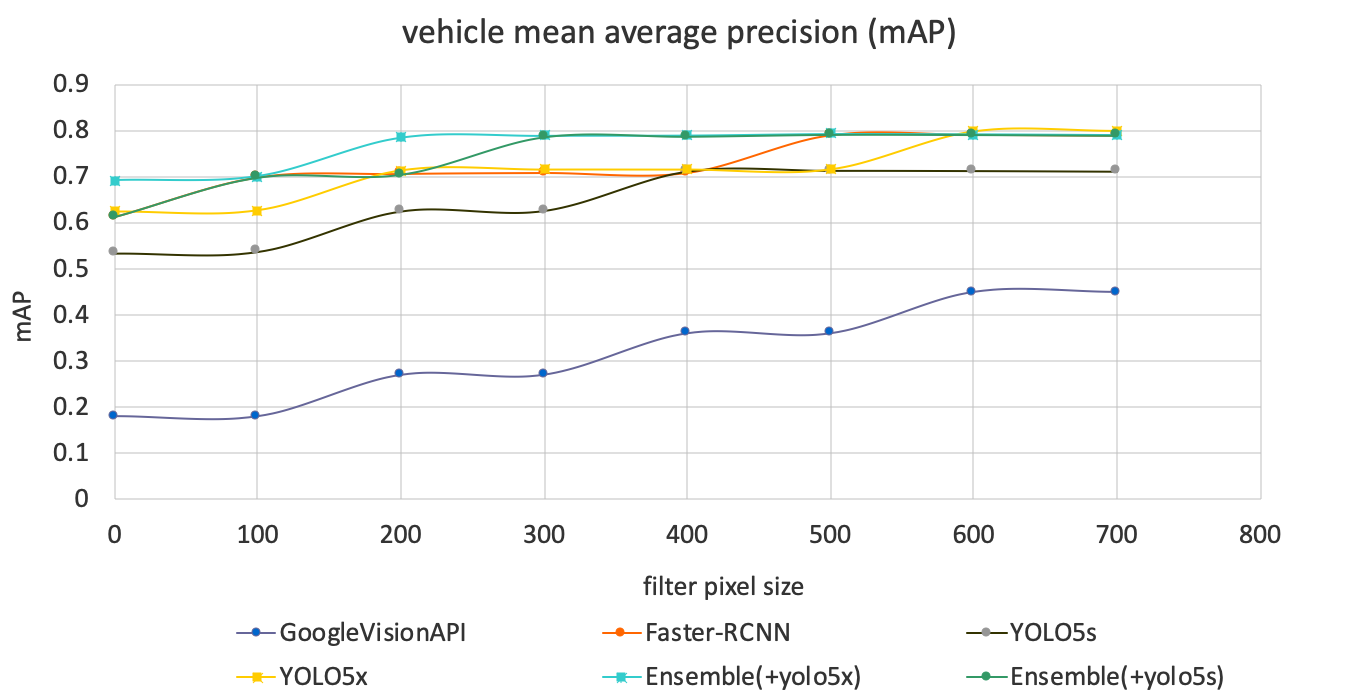
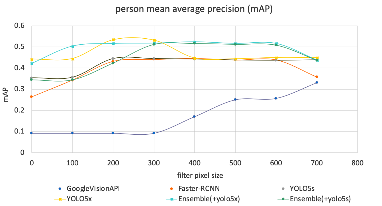
We would like to further investigate the use of YOLOv5 to improve our modelling. Since YOLOv5 and the Faster-RCNN appear to show different strengths for different categories of object, we would like to investigate an ensemble of the two models. Figure 26 presents initial results of the ensemble method, which demonstrates better performance than either individual model.
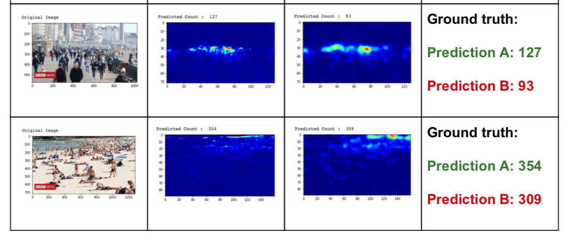
Crowd density analysis
Crowd density analysis is used to estimate the number of objects in images where individuals are closely packed in crowds and so the normal object detection may fail. We have undertaken initial experiments to evaluate some pre-trained models under c-3 open framework and examples of results are shown Figure 27.
Figure 27: Example of crowd density estimation
8. Team
- Lanthao Benedikt
- Li Chen
- Alistair Edwardes
- Jhai Ghaghada
- Ian Grimstead
- Salman Iqbal
- Chaitanya Joshi
We would like to thank members of the ONS methodology team who worked with us on this project:
- Joni Karanka
- Laura Dimond
Also, thank you to volunteers who labelled the images:
- Loes Charlton
- Ryan Lewis
- Dan Melluish
9. Acknowledgements
The Newcastle University’s Urban Observatory team kindly gave support with NE Travel Data and provided the pre-trained Faster-RCNN model.
10. Updates
7 September 2020
The background section of this article was updated on Monday 7 September to provide further context to the research of The Alan Turing Institute.
30 June 2021
The images traffic cameras produce are publicly available, low resolution, and are not designed to individually identify people or vehicles.
However, during further work we’ve found a rare set of cases where vehicle number plates could be identified in certain circumstances.
We’ve published a technical blog that explains how we use an image downsampling method to reduce image resolutions, which then blurs any fine detail such as number plates, resulting in non-identifiable data being stored and processed.
We have also now released the source code to GitHub under the “chrono_lens” repository.
15 December 2021
We have released version 1.1 of “chrono_lens” on our open GitHub repository. A major refactoring of the code means the traffic cameras project can now run on a single, stand-alone computer as well as Google Compute Platform (GCP) infrastructure.
The requirements for the stand-alone computer are modest, with a mid-range laptop sufficient to process in the region of 50 cameras every 10 minutes. Your laptop will need:
- quad-core processor, 2.5GHz or above
- a minimum of 4Gb memory
- no GPU
- broadband internet connection
The camera image ingestion and object identification are supported, with full instructions on how to use `crontab` with UN*X or MacOS, noting that a similar approach also works under Task Scheduler in Microsoft Windows.
This is the result of our initial collaboration with Statistics Sweden on the ESSNet project. We have opened up the system to enable more people to use it locally without needing to set up a GCP account and related overheads. We have so far ported the Python Cloud Functions for local processing. These can now generate a CSV file per day to record object counts from the specified camera feeds (of which Transport for London’s open feed is provided as an example). CSV output was selected to enable the user to ingest into a database system of their choice without forcing any particular infrastructure or system dependencies.
The imputation and seasonal trend analysis is unported, but is still provided in the virtual machine folder, where the user can use this locally. Please be aware:
- that the `R` code still assumes data is stored in GCP BigQuery, so users will need to port the data ingestion to their preferred storage system to make use of this;
- of the large memory requirements when using this `R` code. Refer to the open repository for further details.