Visualising rail schedules using open data
Rail services can be affected by temporary factors such as unseasonably hot weather, industrial action and engineering works. To help inform contingency planning for potential rail service disruptions, we were tasked with helping policy makers from Cabinet Office (CO) understand the impact of known future events on train services at individual stations across Great Britain.
Although a large amount of open data exists for rail travel, it can be difficult to visualise geospatial patterns of disruption on any given day. We produced maps that showed service levels at every station in Great Britain, using an existing daily feed of timetable data from Rail Delivery Group that gives departure and arrival times for every train running on a particular day.
These data are typically stored in text format to be used for services such as journey planners. We used open-source software tools to calculate the total number of timetabled trains that would normally stop at a station on a given day, as published by train operating companies seasonally. To understand the extent of reductions in services on disrupted days, we also looked at any revisions to the daily schedules, which could include cancellations, additions and amendments. For every station, we visualised the latest planned service level as a proportion of the originally timetabled service levels.
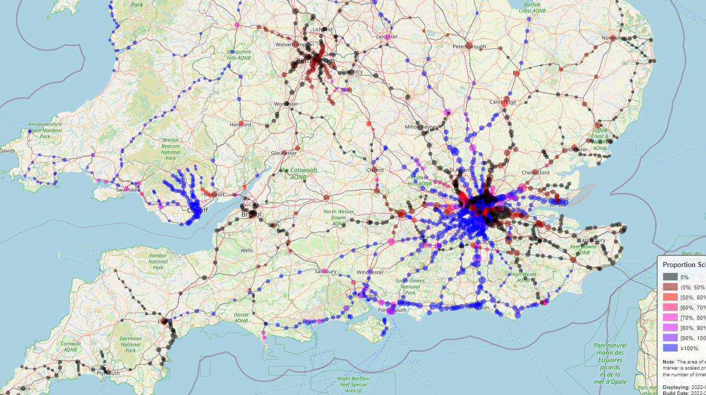
Figure 1 shows an interactive map of the number of scheduled services as a proportion of the timetabled services for Saturday 13 August 2022. The size of the circles on each station is proportional to the number of timetabled trains that typically stop in the station, while the colour of the circles relates to the proportion of timetabled trains that are due to be running that day (black circles indicate a station with no services running). The map has an address search, panning and zoom functionality, and stations can be clicked on to view additional information about them. In the top right corner, there is the option to change the base map between a version that highlights the train network and an option that is more accessible.
Figure 1: Interactive visualisation showing the number of scheduled services as a proportion of the timetabled services, Great Britain, 13 August 2022
We also produced a similar visualisation that cycles through the next 21 days to give a longer advance look at planned service levels. Figure 2 shows an interactive map illustrating the number of scheduled services as a proportion of the timetabled services from 11 August to 31 August 2022.
Figure 2: Interactive visualisation showing the number of scheduled services as a proportion of the timetabled services over the 21 days from 11 August to 31 August 2022
Data and methods
Data have been obtained from the Rail Delivery Group via a daily feed, which is available for reuse. Data are made available to us overnight each day, from which we generate the visuals.
Data are provided in a standardised ATOC.CIF format (PDF, 1273KB) from which files could be read as text in Python. We developed a parser to aggregate the train schedule on any given day (after cancellations, exceptions, and amendments) and visualise the number of services scheduled at any given station. In addition, the inbound data are converted to General Transit Feed Specification (GTFS) format and interactive visualisations are generated using the Folium library. We intend to make the code open source as soon as possible.
We define station “service levels” to be where a train is reported to have stopped at a station at any time during a day. Tube and bus replacement services (full or partial) are also typically captured as a service.
It is important to note that these data have several caveats and limitations. The data are all based on individual train operating companies reporting changes to planned services. Therefore, data quality is determined by how often and how frequently this is done by each company. Analysis suggested that the frequency of train operators submitting schedule changes varied, but we could not infer any differences in quality from this.
Visuals only illustrate the known schedules as of 11 August data; any changes after this point will not be present in the data. Any timetable entry, regardless of permanence, may be subject to further change as a date gets nearer, so a more accurate picture of station activity will develop over time.
It is also possible for stations to have greater than 100% timetabled services running on a day, because of factors including emergency timetables, rerouting or additional services being added. Another exception arose on 30 July, when a regular shuttle service to and from Birmingham International offset significant service reduction at Birmingham New Street in the first weekend of the Commonwealth Games.
We are currently exploring the feasibility of updating these visuals on a regular basis, and would welcome feedback and suggestions on this work by email to datasciencecampus@ons.gov.uk. This work is part of a wider project in the Campus looking at access to services using public transport across the UK, which open data such as these can also help to provide insight into.
3 comments on “Visualising rail schedules using open data”
Comments are closed.
‘minimising the impact of industrial action’ is a very telling definition of ‘data science for public good’, from the methodologically politically-neutral civil service..
gbr,once established,should be able to obtain the extra commercial data from train operating companies for you,thus producing a complete picture.
Lovely piece of data collection, crunching and mapping, but rather worrying compliance with political ‘tasking’ . Careful , ONS.