Transport Performance: A reproducible and reusable toolkit for measuring transport network performances internationally

We have built a new, open-source toolkit for measuring the performance of urban centre transport networks. It can be applied throughout the UK and internationally, providing the benefit of a common methodology to generate comparable transport insights across countries.
Using this toolkit, we have also constructed new experimental statistics as a proof of concept. We have produced results for 30 urban centres across Great Britain, and to demonstrate the international reproducibility of the tool, 17 urban centres throughout France. These data are hosted on the ONS Open Geography Portal and are discussed in more detail within this article.
This work on transport network performance in urban centres builds on an existing area of interest for the Data Science Campus (DSC). It follows publications on UK-wide hyperlocal public transit accessibility in 2023, and a more recent project producing small area bus service reliability metrics. All these projects complement one another and demonstrate our commitment to producing innovative, accessible insights through applying modern tools to open data.
Overview
The performance of transport networks are highly variable throughout and between countries. There is often a lack of consistent and comparable data which can make it difficult to understand these differences. This is typically because of computational complexity, transparency (closed-source and paid services), and data consistency (format and availability).
To start resolving these issues, we aimed to produce robust, open-source tooling to assist the public, other government organisations, and National Statistical Institutes (NSIs) to undertake their own transport performance analysis using a comparable methodology, data, and performance metric. We built this toolkit by bringing together a range of open-source packages, tools, and research. It consists of a Python package and Docker image hosted on GitHub to allow others to:
- Define an urban centre boundary based on population density;
- Inspect, clean, and process public transit timetable data and Open Street Map data; and
- Conduct multimodal routing and calculation of a range of transport metrics.
We hope that the public, other public sector organisations, and NSIs can collaborate and build on this toolkit, to help improve the international comparability of statistics and enable higher frequency and more timely comparisons.
Transport Performance: A Definition
Transport Performance (TP) is a metric originally developed by the European Commission in their 2020 work on low carbon urban transport accessibility. TP puts the population at the centre of its definition by measuring how efficiently a transport network could move the surrounding population to a destination within a certain time frame. A TP value of 100% would mean all the nearby population can travel to a location within the time threshold.
Because TP is dependent on the surrounding population and the destination itself, it is highly variable across an area. For this reason, it is calculated on a granular scale to build up the TP picture across the area of interest. In this work we used populated 200x200m cells. Figure 1 illustrates how TP is calculated for one cell in the centre of Newport, Wales using a 45-minute time threshold.
Figure 1: Accessible and proximity population definitions using a 200x200m cells and an example destination in the middle of Newport, Wales. Source: ONS Data Science Campus, April 2024.
Figure 1 uses a green marker to denote the destination cell and a red dashed line to illustrate the boundary of the nearby population. The dark pink region in Figure 1 (a) represents the accessible population. This is the total population that can reach the green marker within the time threshold using the transport network. The dark blue region in Figure 1 (b) represents the proximity population. This is the total nearby population within the distance limit. To calculate the total accessible and proximity populations, we then count the population across all highlighted cells respectively. The transport performance of the network when travelling to the destination is then the ratio of the accessible and proximity populations (multiplied by 100 to convert to a percentage), as shown in Equation 1: \(\)
$$ T_i(t_{max}, d_{max}) = 100 \times \frac{P_{access, i}}{P_{proxi, i}} $$
- Ti is the transport performance of destination cell, i.
- tmax is the maximum time threshold.
- dmax is the maximum distance threshold (the limit on proximity population from the destination).
- Paccess,i is the total population that can travel to destination cell, i , within tmax and dmax.
- Pproxi,i is the total population within dmax of destination cell, i.
This calculation is repeated across every destination cell within the urban centre to construct the transport performance throughout the entire area. An example of this for Newport, Wales is shown in Figure 2.
Figure 2: Transport performance across Newport, Wales. Public transit within 45 minutes. The solid red line denotes the boundary of the urban centre. Source: ONS Data Science Campus, April 2024.
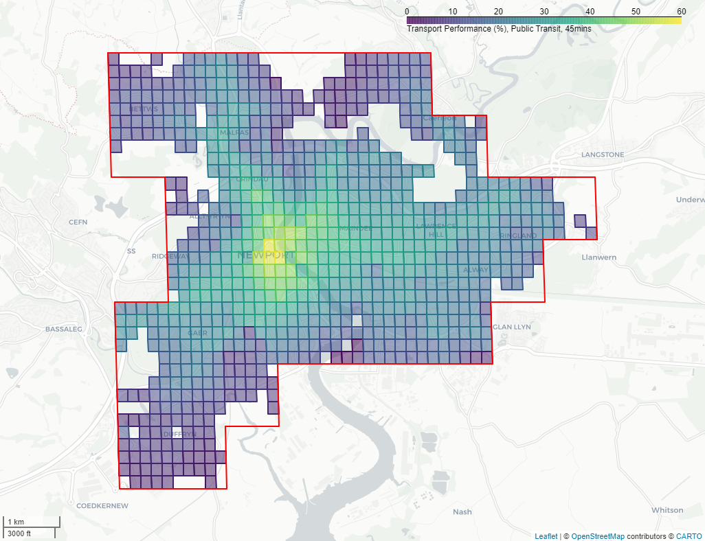
In this work, we considered only the public transit network (plus any required walking legs of a journey for transit access, transfer, and egress). The time and distance thresholds used were 45 minutes and 11.25Km respectively. These limits match the parameters selected in the 2020 European Commission work, where the time threshold represents a reasonable upper estimate of typical commute durations.
A novel addition to this work, and to the toolkit, is the calculation of transport performance using median travel times at 1-minute increments. We did this between 08:00 and 09:00 on a Tuesday in April 2024. In this scenario, the median travel time to destination cells must be within the maximum time threshold to be considered reachable. This approach controls the impact of biases introduced by lower public transit service frequency (for example, when the destination is reachable only once/several times an hour). These biases are particularly prominent when performing transport analyses at a single time point, and this methodology mitigates such circumstances.
For more details on the implementation, see the methods and data sources section. It is also recognised that this analysis configuration may not suit all use cases, so the date, time, modes of transit (public transit, private car, cycling, and walking) and thresholds are all configurable in the toolkit. See the toolkit section for more details.
Key Results
The headline results for a selection of 47 urban centres across Great Britain (GB) and France are shown in Table 1. The 200x200m gridded results are available in an interactive map which shows the urban centre public transit transport performance across all the urban centres analysed (note: there may be a slight delay in loading the interactive map depending on the device you are using). These data are also hosted on the ONS Open Geography Portal, which can be linked to a broad range of data to facilitate analysis of service accessibility across different urban areas.
As transport performance is calculated at a granular level, there are various ways that the data can be assessed for the urban centre as a whole. We advise considering a broad range of statistics that help explain the distribution of performance across an area rather than a single number. Table 1 reflects this by summarising the transport performance of an urban centre with several metrics.
The maximum transport performance corresponds to the most accessible location within the urban centre. The accessible population to the cell with the maximum transport performance gives an indication of the total nearby population that can reach that location. The 95th percentile is an alternative metric which is less sensitive to potential outliers while still focusing near the region with the greatest transport performance. The 90:10 ratio provides an indication of the range throughout the urban centre, with a larger number indicating a larger difference between the top and bottom 10%. The urban centre area accessible by at least 1 in 3 proximity population provides an insight into the performance of the transport network over a wider area.
Table 1: Transport performance results for a selection of 47 urban centres across GB and France, public transit, 45 minutes. Source: ONS Data Science Campus, April 2024. * Accessible by 1 in 3 proximity population.
| Country | Urban Centre | Population (Pop) | Area (Km2) | Average Pop Density (pers/Km2) | Accessible pop (Max TP) | TP Maximum (%) | TP 95th Percentile (%) | 90:10 Ratio | Urban Centre Area Accessible* (%) |
| England | Birmingham | 2,508,270 | 645 | 3,889 | 736,552 | 46.9 | 24.1 | 3.1 | 0.5 |
| England | Blackburn | 142,227 | 42 | 3,386 | 192,409 | 69.5 | 45.8 | 4.3 | 16.6 |
| England | Blackpool | 185,189 | 52 | 3,561 | 161,472 | 59.9 | 46.1 | 2.6 | 43.0 |
| England | Brighton | 299,984 | 54 | 5,555 | 287,093 | 78.2 | 66.4 | 3.0 | 63.5 |
| England | Bristol | 598,038 | 129 | 4,636 | 358,841 | 49.3 | 29.8 | 3.3 | 3.2 |
| England | Cambridge | 133,429 | 33 | 4,043 | 148,904 | 65.7 | 57.1 | 2.6 | 58.3 |
| England | Hastings | 86,202 | 23 | 3,748 | 119,748 | 74.6 | 64.7 | 2.4 | 64.8 |
| England | Hull | 312,685 | 86 | 3,636 | 243,449 | 65.9 | 42.5 | 3.5 | 14.8 |
| England | Leeds-Bradford | 1,032,902 | 317 | 3,258 | 437,240 | 57.0 | 28.6 | 4.9 | 2.7 |
| England | Liverpool | 923,622 | 244 | 3,785 | 593,376 | 58.0 | 30.4 | 4.1 | 2.5 |
| England | London | 9,937,202 | 1,619 | 6,138 | 3,439,262 | 82.3 | 41.0 | 5.0 | 10.3 |
| England | Manchester | 2,460,191 | 731 | 3,366 | 780,903 | 53.2 | 24.2 | 3.9 | 0.8 |
| England | Milton Keynes | 201,685 | 72 | 2,801 | 193,502 | 68.7 | 38.5 | 3.1 | 10.6 |
| England | Newcastle | 740,264 | 219 | 3,380 | 539,886 | 69.7 | 36.6 | 3.5 | 8.0 |
| England | Norwich | 186,610 | 55 | 3,393 | 184,521 | 65.6 | 52.5 | 3.3 | 29.9 |
| England | Nottingham | 634,775 | 175 | 3,627 | 506,494 | 70.4 | 44.6 | 4.6 | 17.7 |
| England | Plymouth | 211,190 | 56 | 3,771 | 200,009 | 64.3 | 53.8 | 5.8 | 39.7 |
| England | Portsmouth | 455,070 | 133 | 3,422 | 299,671 | 55.9 | 38.3 | 5.2 | 15.6 |
| England | Sheffield | 533,613 | 151 | 3,534 | 401,031 | 56.5 | 33.3 | 4.2 | 5.2 |
| England | Southampton | 323,977 | 75 | 4,320 | 259,479 | 47.6 | 31.6 | 4.5 | 3.9 |
| England | Stockton-On-Tees | 159,951 | 49 | 3,264 | 192,663 | 49.7 | 33.4 | 4.1 | 5.6 |
| England | Stoke-On-Trent | 323,483 | 111 | 2,914 | 173,781 | 39.4 | 27.4 | 3.6 | 1.4 |
| England | Torquay | 61,238 | 18 | 3,402 | 110,348 | 51.3 | 41.9 | 3.0 | 21.3 |
| France | Angers | 150,266 | 42 | 3,578 | 182,908 | 74.4 | 66.4 | 2.4 | 80.9 |
| France | Bordeaux | 601,505 | 175 | 3,437 | 426,257 | 59.4 | 45.5 | 4.8 | 19.5 |
| France | Brest | 126,279 | 34 | 3,714 | 147,579 | 70.3 | 60.6 | 2.4 | 75.7 |
| France | Calais | 69,893 | 21 | 3,328 | 76,267 | 69.8 | 65.8 | 4.0 | 75.8 |
| France | Grenoble | 339,096 | 77 | 4,404 | 354,308 | 83.8 | 75.7 | 4.4 | 72.2 |
| France | Le Mans | 137,210 | 42 | 3,267 | 153,952 | 69.7 | 62.7 | 5.1 | 65.1 |
| France | Lille | 928,312 | 230 | 4,036 | 674,881 | 78.0 | 57.9 | 8.8 | 33.4 |
| France | Limoges | 105,936 | 29 | 3,653 | 142,072 | 72.7 | 64.9 | 2.9 | 80.8 |
| France | Lyon | 1,142,155 | 230 | 4,966 | 958,426 | 77.9 | 59.9 | 9.2 | 31.9 |
| France | Marseille | 855,482 | 155 | 5,519 | 760,742 | 85.6 | 61.2 | 12.4 | 35.8 |
| France | Montpellier | 312,344 | 69 | 4,527 | 304,789 | 66.2 | 52.3 | 6.1 | 42.0 |
| France | Nantes | 427,803 | 113 | 3,786 | 424,640 | 71.1 | 55.7 | 3.2 | 49.2 |
| France | Nice | 387,122 | 88 | 4,399 | 267,205 | 59.0 | 47.7 | 11.9 | 18.9 |
| France | Paris | 9,113,551 | 1,345 | 6,776 | 4,537,264 | 85.5 | 50.6 | 6.5 | 11.9 |
| France | Perpignan | 116,078 | 31 | 3,744 | 151,257 | 57.6 | 46.0 | 5.1 | 27.2 |
| France | Rennes | 237,367 | 50 | 4,747 | 290,546 | 74.6 | 67.3 | 2.7 | 81.9 |
| France | Toulouse | 601,922 | 176 | 3,420 | 511,086 | 68.5 | 55.6 | 8.3 | 32.2 |
| Scotland | Aberdeen | 182,570 | 49 | 3,726 | 203,743 | 85.6 | 71.6 | 3.0 | 72.7 |
| Scotland | Dundee | 152,554 | 50 | 3,051 | 148,133 | 80.2 | 63.4 | 2.3 | 67.1 |
| Scotland | Edinburgh | 507,521 | 115 | 4,413 | 445,968 | 78.8 | 57.1 | 2.8 | 38.9 |
| Scotland | Glasgow | 946,292 | 294 | 3,219 | 624,031 | 65.6 | 33.8 | 4.7 | 5.7 |
| Wales | Cardiff | 376,110 | 96 | 3,918 | 318,724 | 68.7 | 39.7 | 3.7 | 9.6 |
| Wales | Newport | 116,185 | 40 | 2,905 | 147,580 | 58.1 | 39.3 | 4.3 | 11.8 |
| Wales | Swansea | 135,572 | 43 | 3,153 | 121,065 | 40.3 | 32.3 | 3.8 | 4.1 |
Toolkit
Our aim has been to lower the bar for others wishing to undertake their own studies of transport performance – for the public, within government and also other NSIs. The Data Science Campus has openly published the code used to produce the Transport Performance Statistics:
- Transport Performance Python package on GitHub
- Transport Performance Docker image on GitHub
Both code repositories provide users with illustrative examples of how to reproduce the analysis. The docker image allows users to reproduce the development environment used to produce the published transport performance metrics.
Note that sourcing more recent input data sources will likely yield different results, for example, depending on the date of the public transit schedules. If you would like to reproduce the analysis entirely using the same inputs, please reach out to datacampus@ons.gov.uk requesting the data, with ‘transport performance’ in the subject line of the email.
The Docker image also allows users to preprocess and validate public transport timetables and allows others to conduct their own transport performance research by modifying parameters such as:
- Analysis area (no strict requirements on urban centres)
- Date of analysis
- Time of day
- Transport modes such as walking, cycling, public transit, and private car (can be multi-modal)
- Maximum journey duration
Next Steps
The team that produced the Transport Performance work are currently consulting with a range of public sector organisations to understand their policy priorities around transport and accessibility. We welcome feedback either through GitHub or by contacting datacampus@ons.gov.uk.
The Data Science Campus have also conducted a related investigation into the use of real-time bus data in England. This is made possible by the publication of bus locations through the Department for Transport’s Bus Open Data Service. It is hoped that this will aid the production of more granular and timely punctuality insights using the real-time data. Furthermore, it is theoretically possible to use this data as an input to this toolkit which would provide transport performance insights using the real time data – more exploration on its feasibility is required. See the further directions and development section for more details.
The Department for Transport (DfT) will also publish separate connectivity figures later this year (2024). These will be based on a different methodology that is focussed on a more detailed assessment of connectivity in England and Wales, rather than on making international comparisons. In addition to travel times, the DfT methodology also takes account of other factors, such as: destination types, their value, and how likely people are to visit them.
Comparing Urban Centre Public Transit Across France and Great Britain: An Analysis
This section compares and contrasts urban centres across Great Britain and France using the experimental transport performance metrics introduced previously.
1. Main Points
- Larger and more sparsely populated urban centres generally have poorer public transit transport performance.
- Public transit transport performance is generally greater in France and Scotland than England and Wales, but a high variance within countries means this is not always the case for all urban centres.
- In particular, urban centres in France, with a population ⪆ 250,000 and ⪅ 1,500,000, tend to have greater accessible populations than those of a similar size in Great Britain.
- London and Paris are notable exceptions as large, densely populated urban centres with high public transit transport performances with respect to their size.
2. Methods and Data Sources
Figure 3: An overview of the transport performance calculation methodology.
Source: ONS Data Science Campus, April 2024.
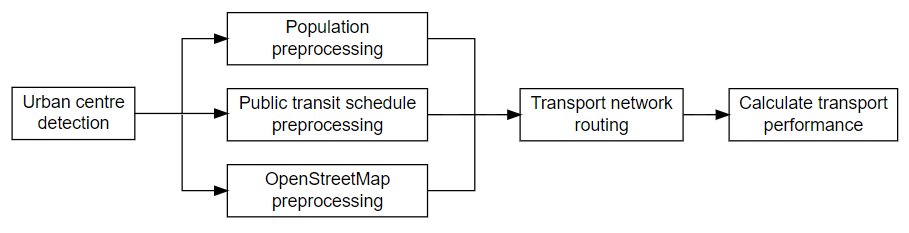
In this work, the process of calculating transport performance for an area starts with urban centre detection, as shown in Figure 3. This definition was created by Eurostat, and represents high density population clusters (see the Eurostat level 1 degree of urbanisation methodology document for more details). In short, it is a cluster of contiguous 1Km2 grid cells with a density of at least 1,500 inhabitants/Km2 and a total population of at least 50,000. We selected this definition as it can be consistently applied internationally.
Population estimates were based on the Global Human Settlement Layer (GHSL). The GHSL-POP layer provides high resolution estimates with worldwide coverage. It uses combined satellite imagery and national census data to produce population estimates down to 100 metre grids (see section 2.5 of the GHSL technical paper for more details). In this work we used the R2023A dataset release. We then aggregate to 200 metre grids as a balance between achieving granular results and performance at the transport network routing stage.
With public transit performance being the focus of this proof-of-concept work, schedule data is a core input (for other modalities this step is not required). We use the widely adopted General Transit Feed Specification (GTFS) data to define the public transit network. This is scheduled data; therefore, the effects of delays (such as traffic) and service capacity are not accounted for in the final transport performance results. We did however use the latest available data which will account for known service changes.
For Great Britain, there are two sources of GTFS data. For all public transit modalities excluding rail, the Department for Transport Open Data Platform provides both country wide and regional GTFS data. For rail schedules, the Rail Delivery Group provides open data in ATOC format (sign-up required) covering the whole of Great Britain. The ATOC data was converted into GTFS format using the UK2GFTS R package.
For urban centres across France, the Ministère Chargé des Transport Open Data Portal was used to obtains the necessary GTFS sources. We used their open API to access the GTFS inputs required for the area of interest.
The underlying road/path network was built using OpenStreetMap (OSM) data. OSM is an open, community-maintained source of worldwide map data. OSM data provides the spatial information about the street network, such as road and pathway locations, speed limits, transport rules and junction locations. We used raw OSM data provided by Geofabrik and processed them to cover the required localities of the urban centres.
The transport network routing stage calculates the feasible journeys to every destination cell within the urban centre over multiple departure times. We used the Python package R5py, which is a wrapper of Conveyal’s R5 – a highly performant transport routing engine based on RAPTOR (Round-Based Public Transit Routing).
This improves upon our previous transport modelling work by calculating robust median travel times over many journeys. Indicative travel times at a single journey departure time can vary significantly, depending on the public transport service availability within the locality of the journey. Running the model across multiple consecutive journeys produces statistics that fairly represent journey travel times within a given area. For more details see Conway, Byrd, and van der Linden 2017 and Fink, Klumpenhouwer, Willem, Saraiva, Marcus, Pereira, Rafael, and Tenkanen 2022.
The final stage uses the network routing results to calculate the transport performance. See the Transport Performance section for more details on this step and for more information on the analysis configuration used in this work.
As described in the toolkit section this entire pipeline is wrapped in a Python package called ‘transport_performance’. Similarly, there is a Docker image to simplify useability (contains all the necessary dependencies) and improve reproducibility.
3. General Trends: Size Factors
Figure 4 shows the relationships between urban centre size factors (population density, in Figure 4 (a), and area in Figure 4 (b)) and the transport performance 95th percentile for each urban centre. The 95th percentile focuses on the region of the transit network with greater transport performance while being less sensitive to potential outliers (compared to the maximum).
Figure 4 also shows London and Paris as outliers compared to the other urban centres analysed. They are large, major capital cities that have greater public transit transport performances with respect to their sizes. See the comparing London and Paris section for more details.
Excluding London and Paris, there is a moderate positive correlation with urban centre average population density and a moderate negative correlation with area. This suggests that larger and/or more sparsely populated urban centres tend to have lower transport performances. This means smaller and more densely populated urban centres are typically able to get more of their proximity populations into the urban centre using public transit. This may indicate that larger, more sparsely populated urban centres find it challenging to develop sprawled public transit networks.
Beyond size, these observations are also likely influenced by a range of other factors including geography (for example, coastal vs non-coastal areas which impact the directionality of the network) and available public transit modalities. See the potential further analyses section for more details.
Figure 4: Relationships between urban centre size factors and public transit transport performance 95th percentile. Coloured and shaped by urban centre country. Source: ONS Data Science Campus, April 2024.
4. Comparing France and Great Britain
Figure 5 shows the distribution in public transit transport performance 95th percentile by country. In general, it indicates large variation within countries. It also suggests that urban centres in France and Scotland, on the whole, have greater public transit transport performances than those in England and Wales – these tend to be 20-25% greater in France and Scotland. However, due to the large variance within countries, this does not reflect the situation for all urban centres.
Figure 5: The distribution in public transit transport performance 95th percentile by country. All analysed urban centres are included. Source: ONS Data Science Campus, April 2024.
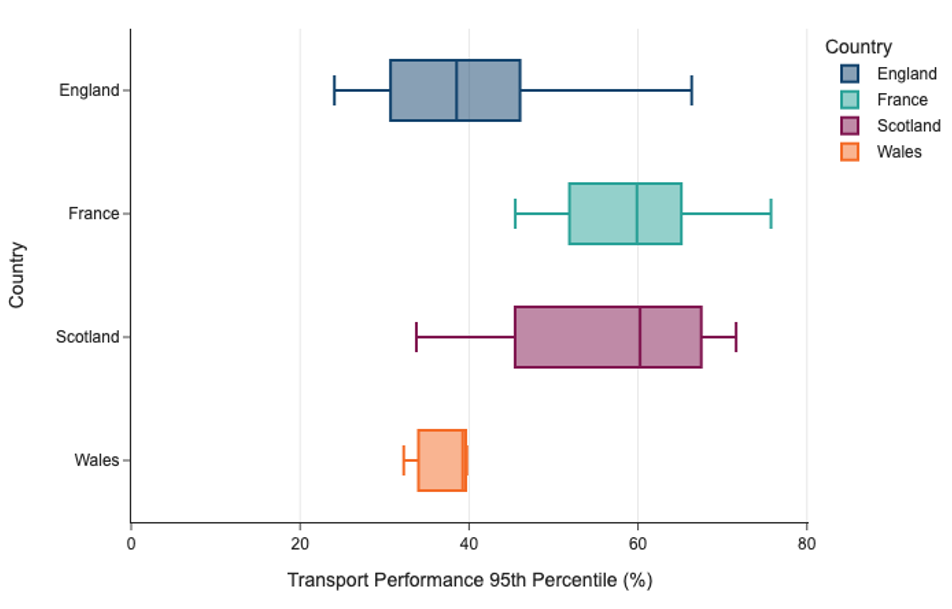
Figure 6 shows the average urban centre coverage that is accessible by at least 1 in 3 proximity inhabitants, by country. Using this, we can investigate the performance of public transit networks over a wider area. This contrasts with Figure 4 and Figure 5, which provide insights into the higher performing regions of urban centres by using the 95th percentile.
Figure 6: Average urban centre coverage that is accessible by at least 1 in 3 nearby inhabitants using public transit within 45 minutes, by country. Each block represents 1% of the urban centre area. All analysed urban centres are included. Source: ONS Data Science Campus, April 2024.
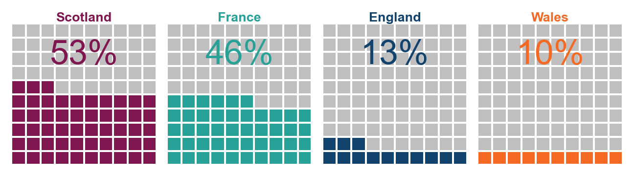
Generally, across French and Scottish urban centres, a far greater area is accessible to at least 1 in 3 proximity inhabitants (using public transport). This may be an indication of a difference in ability for people to access points of interest throughout the urban centre. However, as stated previously, there is noticeable variance, so this observation does not hold true for all urban centres (the standard deviation for Scotland, France, England, and Wales is 27%, 25%, 20%, and 3% respectively).
Figure 7 explores these trends in more detail to determine where the observed differences reside. It displays the relationship between urban centre population and the accessible population to the location with the maximum transport performance. In this way, we obtain a more detailed insight into how well the public transit network scales with urban centre size. When making this comparison, we took a decision to exclude Birmingham, Manchester, London, and Paris. There are several reasons for this:
- The populations and areas of these urban centres lie well outside Tukey fences for both these distributions. This provides evidence that they are highly dissimilar to all other urban centres analysed.
- There are no French urban centres analysed with a similar size (both in terms of population or geographic area) to Manchester and Birmingham.
For these reasons they have not been included and the subsequent findings refer to only comparable ‘smaller urban centres’. Based on the urban centres analysed, these can broadly be defined as urban centres with a population ⪅1.5 million and an area ⪅300Km2.
Figure 7: Urban centre population vs accessible population (to the cell with the maximum transport performance) for ‘smaller urban centres’ in France and Great Britain. Source: ONS Data Science Campus, April 2024.
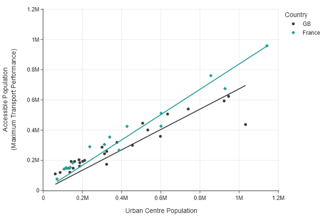
A linear regression analysis, by country for ‘smaller urban centres’, reveals a statistically significant relationship between an urban centre’s population and its accessible population to the location with the maximum transport performance. The estimated coefficients are shared in Table 2.
Table 2: Linear regression coefficient estimates exploring how well population predicts the outcome of its accessible population, for ‘smaller urban centres’ (to the cell with the maximum transport performance). Source: ONS Data Science Campus, April 2024.
| Country | n | Coeff (std err) | 95% CL | t-statistic | P>|t| | R-squared |
| France | 16 | 0.84 (0.03) | [0.78, 0.90] | 29 | <0.01 | 0.98 |
| GB | 27 | 0.67 (0.03) | [0.61, 0.74] | 20.5 | <0.01 | 0.94 |
For Great Britain’s ‘smaller urban centres’, the positive coefficient suggests a significant association. Broadly speaking, for every increase of 100 inhabitants the accessible population increases by 67. This trend is stronger for ‘smaller urban centres’ in France. For every increase of 100 inhabitants, the accessible population is expected to increase by 84. This suggests ‘smaller urban centres’ in France of similar size to those in Great Britain are generally able to get more of their proximity population into the urban centre using public transit.
Relating these observations to the data in Figure 7, it is evident that performance differences between these countries arise when ‘smaller urban centres’ have populations ⪆250,000 inhabitants. Below this value, the respective accessible populations for both French and British urban centres are broadly the same. On the other hand, the larger British urban centres generally have a lower proportion of their proximity population that can access an urban centre using public transit.
5. Comparing London and Paris
London and Paris are major capital cities with far larger urban centre areas and populations. In contrast with the other urban centres analysed, these have greater public transit transport performances, on the whole, with respect to their urban centre’s sizes – as shown in the General Trends section. Table 3 contains the key summary statistics for London and Paris.
Table 3: Transport Performance summary statistics for London, England and Paris, France. Public transit within 45 minutes. Source: ONS Data Science Campus, April 2024.
| Urban Centre | Population (Pop) | Area (Km2) | Average Pop Density (pers/Km2) | Accessible population (Max TP) | TP Maximum (%) | TP 95th Percentile (%) | 90:10 Ratio | Urban Centre Area Accessible by 1 in 3 proximity population (%) |
| London | 9,937,202 | 1,619 | 6,138 | 3,439,262 | 82.3 | 41.0 | 5.0 | 10.3 |
| Paris | 9,113,551 | 1,345 | 6,776 | 4,537,264 | 85.5 | 50.6 | 6.5 | 11.9 |
Despite slight differences in the urban centre area, population and average population density, London and Paris have similar transport performance characteristics. The maximum transport performance metric suggests that they are broadly similar in the most performant regions of the urban centres, despite a large difference in proximity populations (caused by the greater population density in Paris). They also have a similar proportion of their urban centre areas accessible by public transit for 1 in 3 of the proximity population.
However, there is a greater difference in the 95th percentile, which starts to indicate differences reside outside the most performant regions of the urban centres. This is further evidenced by the 90:10 ratio, suggesting the top 10% in Paris is roughly 6.5 times greater than the bottom 10% compared to a difference of just 5 times in London.
Figure 8 shows choropleth maps of London and Paris, highlighting these differences and similarities in in more detail.
Figure 8: Transport performance across London, England and Paris, France urban centres. Public transit within 45 minutes. Source: ONS Data Science Campus, April 2024.
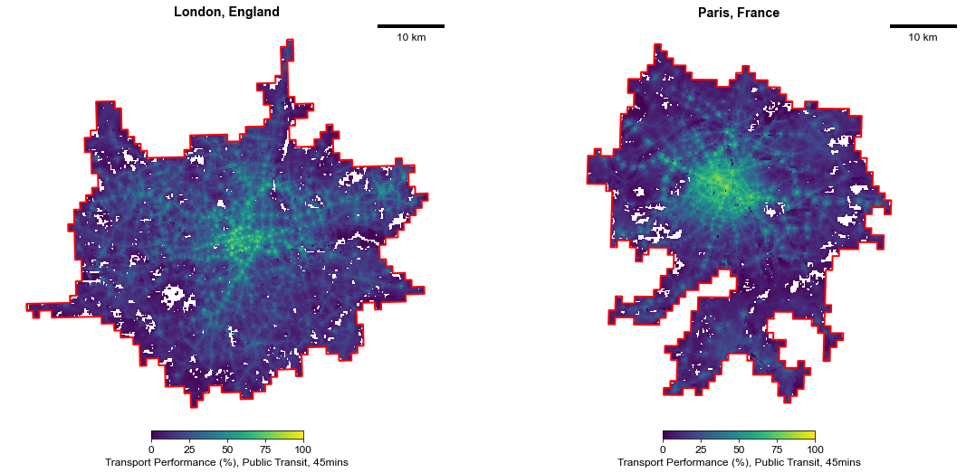
Both urban centres have the shared characteristic of aligning the regions of greatest transport performance with their city centres. Broadly speaking, this is the City of London and the Arrondissements of Paris respectively. Figure 8 also suggests that the public transit networks likely serve to move the population between the outskirts and the centre.
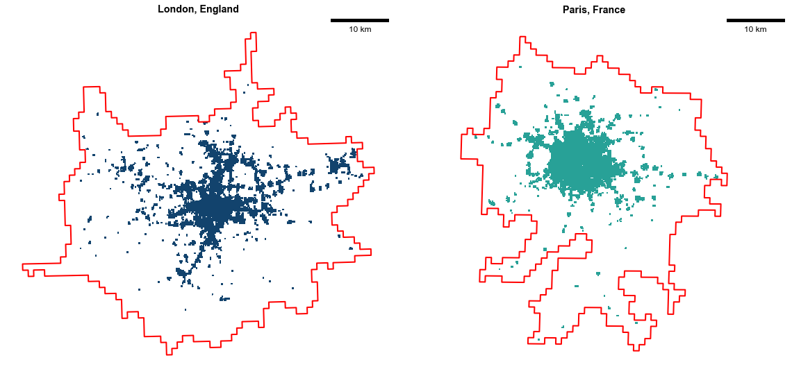
However, there are more noticeable differences in the outskirt regions. Figure 9 shows London and Paris urban centres, highlighting areas accessible by at least 1 in 3 nearby inhabitants using public transit within 45 minutes. London has more isolated regions accessible by 1 in 3 proximity inhabitants, leading to more accessible suburban “spots” around the City of London. This means that the populations within London can generally access more distinct, suburban areas throughout the whole urban centre than those on the outskirts of Paris. On the other hand, Paris has a larger central area accessible by at least 1 in 3 nearby inhabitants serving a much wider area in and around its city centre.
Figure 9: London, England and Paris, France urban centres highlighting areas accessible by at least 1 in 3 nearby inhabitants. Public transit within 45 minutes. Source: ONS Data Science Campus, April 2024.
6. Potential Directions for Future Development and Analysis
A natural extension of this work would be to include more urban centres. This could start with analysing all urban centres in England and France. Then it may extend out to other countries to allow for more comparisons. For other countries, the limiting factor would be GTFS data availability. For example, at present Northern Ireland shares public transit schedules in a different format. This format is not compatible with this codebase. The Campus has experience in converting this data format into useable GTFS. However, breaking changes with the data format prevents their inclusion in this work, and an aim would be to update this analysis to include Northern Ireland.
Through configuration changes, it would be feasible to explore other geographical boundaries beyond urban centres. For example, urban clusters which are smaller areas more equivalent to towns. With minor codebase changes, it would even be possible to replace urban centres with any geographic boundary of interest. This also includes moving from grids to census geographies. Although, this would make international comparisons more difficult.
This codebase, with some very minor changes, can also accommodate other modalities. This presents an opportunity to recalculate similar transport performance metrics beyond public transit. In particular, it is possible to explore private car, cycling, and walking modes. This could also be in single- or multi-modal configurations.
It is also important to consider transport performance at different times of day and its sensitivity to distance/time cutoffs. Extending this way would better represent different population demographics. For example, those that are part of afternoon ‘rush hours’ or are night shift workers. Additionally, repeating transport performance analyses at frequent intervals would build a timeseries for each urban centre. This would give more insights on transport network changes over time. It could also help evaluate the effects of transport policy interventions. The analysis itself could also be extended by combining transport performance metrics with other datasets. For the UK specifically, this could mean linking them with other subnational indicators.
A novel direction would be to link this codebase with real-time public transit data. For example, real time bus location data across England provided by the Department for Transport. This data could be reshaped into a GTFS-like input to feed directly into this codebase. Transport performance metrics would then include affects caused by delays. However, real-time data availability (especially internationally) and missingness need further consideration.