Technical Report: Project Mertz—novel use of historical RAF flight safety records

Part of our mission at the Data Science Campus (DSC) is to build data science capability across the public sector. In this project, which grew out of our Data Science Accelerator programme, we worked with the Royal Air Force (RAF) to help upskill their staff in the Python programming language and natural language processing (NLP) methods. As part of the project, the RAF, the DSC, and the Office for National Statistics’ (ONS) Methodology and Quality Directorate (MQD) worked together to apply data science methods to flight safety incident data to better understand how incidents were related to one another and to discover trends in incident reports. The training, and the project code and findings, are strengthening data science in the RAF as part of its modernisation programme.
The rest of this technical report details the origins of the project, the motivation for looking at flight safety data, and the results of the analysis based on NLP.
1. Background
In 2018, Royal Air Force (RAF) officer flight lieutenant Pete Kennedy participated in the Data Science Accelerator programme. This programme is an opportunity for government employees to submit proposals for projects that they will work on one day per week over 11 weeks with support from an experienced data science mentor from the Office for National Statistics’ (ONS) Data Science Campus (DSC). Applicants are assumed to have little or no data science experience, with the projects providing a supported learning opportunity. The RAF’s proposal was to investigate correlations and patterns in Defence Aviation Safety Occurrence Report (DASOR) data, which over time could contribute to reducing the number of flight safety incidents.
The results of the accelerator project showed there was high potential to further use historic flight safety information held by the RAF. With this initial development project complete, and the promise that more time and effort looking at the problem could yield improvements in flight safety, we worked with the ONS’ Methodology and Quality Directorate (MQD) to further the research. We visited RAF Brize Norton and worked with RAF staff to understand the problems that may prevent even higher levels of flight safety being attained. The topics for further research became:
- trends in incident reporting over time
- patterns in the free text descriptions of previous incidents
- supporting RAF staff to easily find related DASORs
Techniques such as time series and word-embedding analysis were used to demonstrate how the RAF could detect patterns in the DASORs. The selected algorithms enabled non-domain experts to detect known historical issues, providing confidence in this approach.
The RAF is currently modernising the techniques and tools it uses. Key among the foundations of a “Next Generation Royal Air Force” is better use of data and digital technologies. To support this, the ONS have made their Data Science Graduate Programme available to RAF employees, with seven staff enrolled. These participants will be trained in the relevant techniques as part of the upskilling provided by the ONS so that they can take on the techniques showcased in the proof-of-concept work.
This technical report, jointly authored by the ONS’ DSC and MQD, presents the methods and findings of our research and how it could contribute to reducing flight safety incidents.
2. Why the project name “Mertz”?
The Mertz Glacier is a glacier on the west coast of Antarctica. The same name was chosen for this project because the glacier spawns icebergs and, though tenuous, a link was made to the “iceberg” safety model, which we use to describe the risks faced in flight safety. The iceberg model says that for every accident that results in a death, there are a number of incidents that cause serious injury and, for each of these incidents, there are even more distinct incidents that lead to minor injuries. These events are represented by the part of the iceberg above the waterline. Below the waterline, however, the iceberg is much bigger. This part of the analogy represents near misses, hazards, and observations that do not cause harm, but are more frequent compared with actual accidents, and contribute to an unsafe environment.
The iceberg model was first envisaged by Herbert William Heinrich who wrote “Industrial Accident Prevention, A Scientific Approach” in 1931. Heinrich found that for every industrial death, there were 29 major injuries and 300 minor injuries, and he captured this relationship in what he dubbed the iceberg model. Project Mertz follows in the spirit of Heinrich’s study, but here we aim to create a much more detailed model of the iceberg.
3. Timeline of events
Once the Royal Air Force’s (RAF) pilot had completed foundational programming courses on the Ministry of Defence jHub’s Coding Scheme, the next step was to use the coding techniques in a project. The RAF wished to investigate how data science techniques could help improve flight safety by using historical data; the Data Science Accelerator programme fitted perfectly, as this presented the opportunity to collaborate with Office for National Statistics (ONS) experts and learn through a short, practical project. The RAF’s project request was about using natural language processing (NLP) and time series techniques, in which the Data Science Campus (DSC) has expertise. The project results showed the potential of what could be achieved, including more flexible searching and the detection of trends in occurrence rates. This prompted us to look for further opportunities to collaborate with the RAF.
We visited RAF Brize Norton to be introduced to members of the RAF flight safety personnel. We discussed how we could assist and reviewed how flights were planned and safety issues recorded. A follow-up visit was arranged with the safety cell, who showed us how the Air Safety Information Management System (ASIMS) is used to record DASORs, and how the Bow Tie methodology is used for air safety. The discussions resulted in many potential follow-on work topics, which we recorded in the form of “user stories”. This is a device where we record who, what, and why. For example:
As a Flight Safety Officer
I want to find DASORs that contain phrases similar to my search terms
So that I can find DASORs without needing to provide an exact text match
These user stories were then prioritised, focusing on those that were system agnostic and did not benefit commercial software. We delivered proof-of-concept (PoC) code to the RAF for their evaluation, alongside documented methodology, and this enabled the RAF to run the code locally without ONS assistance. The techniques had to be explainable and work within a secure environment. This prevented ingestion of third-party binary data, so pre-trained models could not be used. The ONS opted to use Python as the RAF already had experience in this language, and it has many freely available libraries relevant to the project. The source code and results were presented to the RAF using Jupyter notebooks because of the ability to contain the documentation and code together in a single file, simplifying the task of both reproducing and explaining the results. Unit tests were also supplied to verify the code functionality. The project results are described in the following sections.
4. Results of the investigation
The project investigated three main themes: Defence Air Safety Occurrence Report (DASOR) text similarity, DASOR vector similarity, and time series analysis. In addition, we also investigated word frequency and clustering of related DASORS. These topics are discussed in the separate sub-sections that follow.
DASOR text similarity
When examining (DASORs), we wish to find DASORs that are related, but different phrases may be used to describe facets of an incident. For instance, “St. Elmo’s fire” would be of interest to anyone looking at lightning related issues, but the word “lightning” may not appear at all in the report. In this case, a direct text comparison, such as a keyword search for “lightning”, would not work. Instead of using words directly, we converted them into a numerical representation using word embeddings. These “embed” a word into a vector space such that the word is represented by an N-dimensional vector of real numbers. With words represented as mathematical objects, various mathematical comparison functions can be used to compare how close words are — even if they are written as differently as “St. Elmo’s fire” and “lightning”.
Various word embedding techniques exist, for example, Word2Vec, GloVe, and newer, transformer-based models such as BERT. However, more recent models require a large binary pre-trained model to be ingested and specialist graphics hardware to process the data. These requirements are an issue for security, and specialist hardware requirements are a barrier to long-term re-usability and accessibility. This rules out the latest word-embedding models, but a Word2Vec model can be trained locally on DASORs without the need for specialist hardware; this removes the requirement to ingest a large binary model. Word2Vec is readily available in libraries such as SpaCy and Gensim.
Having selected Word2Vec, we performed training of the models on the DASOR free text descriptions. To increase signal, various filtering approaches were tested; retaining nouns and verbs, case folding (in which all letters are converted to lower case) and removing punctuation provided the best performance boost. An embedding for a DASOR description was created by averaging the embeddings of the words that remained. Sets of pairs of DASORs were examined by a domain expert and labelled as “associated” or “disassociated”. We opted to use “cosine distance” to measure similarity between embeddings. Given that embeddings encode concepts as directions in N-dimensional space – a popular example of embedding relationships is “king – man + woman = queen” – the cosine distance compares closeness of direction and hence concepts. We used 300 dimensions (sufficient to hold signal but not too long to process), generating a similarity value in the range 0 (dissimilar) to 1 (similar).
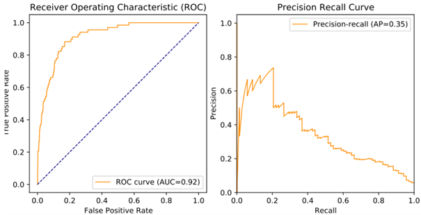
If the cosine distance between two embeddings was above a set threshold, then the model labelled a DASOR pair as “associated” (“positive” result). Otherwise, it labelled a DASOR pair as “disassociated” (“negative” result). The results of using the model were compared against the results of the domain expert; if a “positive” result matched the human’s label, then this is regarded as a “true positive”. Otherwise, it is considered a “false positive”. “Negative” results are similarly regarded as true or false by comparing with the human’s label. Rates of “true positives” and “false positives” against actual positives can be produced by resampling while varying the “positive” threshold. For instance, if we set the threshold to 95%, we are very likely to gather only good matches but reject near matches that may have been considered “associated”; we have mostly “true positives” with few “false positives” at the expense of generating far more “false negatives”. These concepts can be presented graphically in Receiver Operating Characteristic (ROC) curves, showing how the “true-positive rate” varies against the “false-positive rate” as the threshold is changed (see the example presented in Figure 1). “Area Under Curve” (AUC) is also reported as a summary statistic, representing how much of the graph area is captured under the curve, in the range 0 to 1; a value of 0.5 represents random chance, and 1 represents a perfect model.
However, because of the unbalanced nature of the dataset (most DASORs will be disassociated), we can have a high true-positive rate but not have detected all positives; for this, we also used a precision-recall curve. This compares the “precision” (of all positives we flagged, how many were correct?) against “recall” (did we find all positives?). This reveals what proportion of positives our model actually detected. An example is shown in Figure 1, with the average precision (AP) across varying recall values presented as a summary statistic.
Figure 1: Receiver operating characteristic and precision-recall curves for a DASOR similarity model.
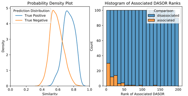
These curves helped review what percentage of positive results we detected, but we also needed insight into where there were any problems. Plotting the quantity of DASOR-pair comparison values against the similarity score can aid in understanding how well the metric is isolating “associated” DASOR pairs from “disassociated” pairs. We plot “true positives” (“associated”) and “false positives” (“disassociated”); an ideal model will reveal no overlap between these two curves. A threshold similarity can then be selected to separate “true positives” from “true negatives”. In Figure 2, the curves do show overlap, but there is separation between the peaks, so a choice for a “threshold similarity” can be selected that will correctly delineate a good proportion of associated DASORs from disassociated.
Considering the problem in terms of information retrieval rather than classification, instead of returning “associated” when the similarity score was above a threshold, we instead returned the top N matching results in case we missed any close matches. To reflect this use case, we also present an example histogram of similarity scores in Figure 2. This alerted us if a high proportion of “associated” results had a low similarity score. Note that there are few “associated” DASORs appearing outside of the top 50 similarity results.
Figure 2: Probability density plot and histogram of DASOR similarity model results.
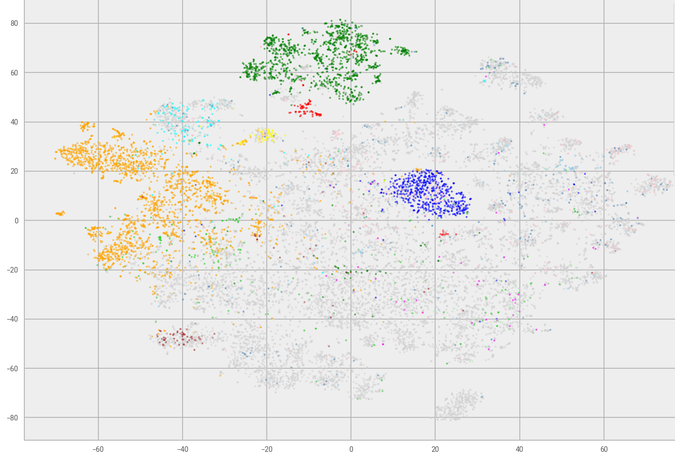
The models were then used to generate embeddings for all DASORs, which could then be analysed to confirm if DASOR semantics had been captured. Similar topic DASORs should generate similar embeddings, so if we can visualise the distribution of all DASOR embeddings, similar topic DASORs should cluster together. As the embeddings have 300 dimensions, we needed to map them into a two–dimensional space, so we could then easily display their relative position and look for clusters. However, for this to work, the mapping must preserve relative distances between points. We could not simply discard 298 dimensions as one of these could show high disparity. We opted to use t-distributed stochastic neighbour embedding (t-SNE), as it is designed so that similar objects are modelled by nearby points and dissimilar objects are modelled by distant points, enabling a simple visual check. We labelled all embedding results with their specific DASOR sub-type (if appropriate, DASORs can be generic or specifically associated with parachuting, bird strikes, etc), with results presented in Figure 3. Not all DASORs have a specific type; these are coloured grey and form the majority of DASORs. However, there are visual clusters appearing such as the orange, green, navy blue and light blue types. This shows promise, as the various flags are clustered, which implies that similar types of DASOR generate similar embeddings.
Figure 3: t-SNE plot of DASOR embeddings, DASORs coloured by sub-type.
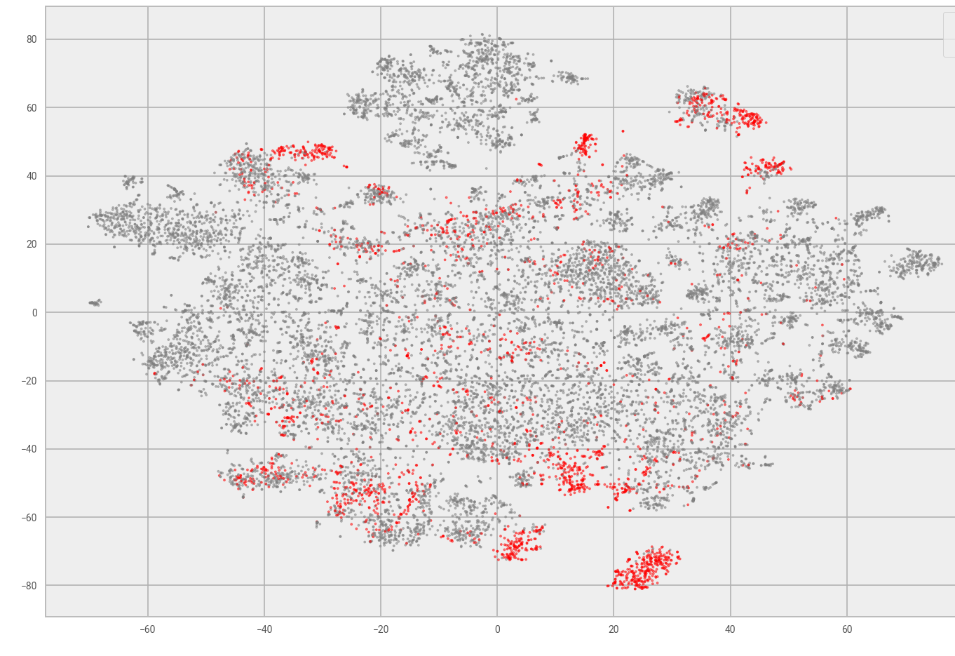
Further, marking DASORs associated to particular aircraft types highlights if DASORs for this aircraft are similar, an example of which is shown in Figure 4. Again, DASORs clustered, which is to be expected. For example, “jet aircraft versus turboprop” and “passenger versus transport aircraft” all have different tasks and equipment, so they should cluster. This mapping enables a domain expert to identify clusters of DASORs and check for patterns, as well as variation over time. This may still reveal hundreds of DASORs, but it is a large improvement on the initial dataset, which contains over 100,000 records. A cluster could be analysed by similarity of the numerical fields, as discussed in the next section, or other text analysis or time series trends, both of which are discussed later.
Figure 4: t-SNE plot of DASORs with single aircraft type highlighted.
DASOR vector similarity
In addition to the textual description fields, the categorical and numerical fields also determine if a DASOR) is similar. One option is to simply map the remaining fields into a vector form and append to the text embedding that we presented earlier, but this will not produce sensible results without further work. For example, the 300 fields representing text will be the majority of the vector; values need to be normalised because an altitude of 20,000 feet cannot be compared with a wind strength of force 2, and so on. Furthermore, not all fields are mandatory (or relevant to every DASOR); the wind strength does not matter if an incident occurred in a hangar.
With this in mind, we developed a custom way of comparing pairs of DASORs, A and B. We create an empty “comparison vector” for both A and B; we populate the vectors as we examine each field and output a pair of N-dimensional vectors – noting that N is variable as it depends on how many fields are present. Each field is examined in turn; if it is missing in both DASOR A and B, we skip this field. If it is present in one vector only, we record a mismatch (append a `1` to vector A and a `0` to vector B). If a field is present in both: if it is categorical, we store a `1` in both if it matches, a mismatch otherwise. If a field is ordinal and present in both, we normalise the DASOR A and B values in vectors A and B respectively (mapping the ordinal value into the range 0..N, we then divide by N). If a field is boolean and present in both, we ignore the field if both DASORs flag `False`, assuming neither DASOR is interested (as flags can be used to determine if extra information is present). Otherwise, we append a `1` for `True` and `0` for `False`, appending DASOR A and B’s field values into the comparison vector. Finally, numerical values present in both are normalised and appended to the vector. A pair of comparison vectors is thus generated.
The resulting vectors are compared through angular distance, producing a value in the range 0..2, where 0 is the same angle (similar), and 2.0 represents a 90 degree angle (orthogonal, opposite values). A DASOR of interest is thus selected, and all other DASORs are compared against it, generating a score; the DASORs are sorted by score and the top N presented to the user.
This enabled a comparison of non-text fields – manually selecting a range of DASORs and checking the proposed matches looked promising, as the matches looked reasonable. The text embeddings are not included, and some fields will need to be weighted more than others; however, this approach showed merit and provided a starting point for further work.
DASOR word frequency
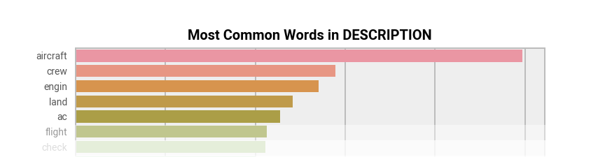
Word frequency was examined in the DASOR description text. This is a useful way of looking at word usage, and hence theme over time, and very explainable. We removed punctuation, folded all words to lower case and then stemmed. Stemming is using rules to remove word endings, so different forms of words map to a root “stem” (such as “raining” and “rained” both being replaced with “rain”), reducing the range of words and, hence, increasing signal. These words were then processed using Term Frequency, Inverse Document Frequency (TF-IDF) as this is explainable and works well when word counts in a document are divided by the number of documents containing that word. This means common words (“the”) have a low score as they appear in many documents, whereas rarer words (“brize”) are penalised less. We processed the free text description in our subset of DASORs, resulting in counts such as those in Figure 5.
Figure 5: Most common unigrams in DASORs as detected by TF-IDF.
These are hard to interpret as there is no context; instead, using word pairs and triples (bigrams and trigrams) gives context, such as the graph presented in Figure 6.
Figure 6: Most common bigrams and trigrams in DASORS as detected by TF-IDF.
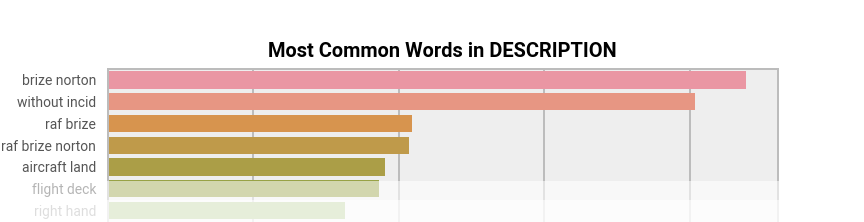
Here we can see that “Brize Norton” was detected as a bigram that was unusual and appeared repeatedly, which makes sense given that we were working with Brize Norton’s DASORs. The terms detected as being of interest can then be plotted as occurrence counts per month against time, showing how terms rise and fall in popularity. A safety officer can then detect if a new trend is in progress – it may be a change in reporting culture or a new pattern of incidents, but a domain expert could investigate and determine the cause. Such “change points” are discussed in the later section on time series analysis.
DASOR clustering
Further to Term Frequency, Inverse Document Frequency (TF-IDF) scores, the TF-IDF itself forms a matrix where rows are the DASORs, columns are the terms, and the matrix cells are the TF-IDF scores. This then gives an alternative vector representation per DASOR (versus word embeddings covered earlier), which can then be used as input to an unsupervised clustering technique. We selected k-means as it is simple and explainable. You choose k-samples as initial clusters, select the next sample and assign to the cluster with the nearest mean, recalculate the mean of the cluster, and repeat for remaining samples.
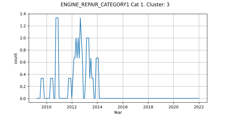
Applying k-means to parachuting tagged DASORs with three clusters requested resulted in “generic equipment”, “landing issues” and “canopy issues”. Filtering by specific aircraft type and repair–category–generated clusters, generating three clusters for a particular aircraft produced “general faults”, “bird strikes” and “a known historical issue”. Interestingly, when counts of DASORs in each cluster were plotted over time, the known issue could be seen (see Figure 7) and the impact of the fix shown as DASORs were no longer generated in this cluster. This showed where a non-domain expert could glean insight from the data, supporting the concept that a domain expert could reap benefits from these techniques.
Figure 7: Number of DASORs in an example cluster over time.
Different numbers of clusters were tested, but the higher the number of clusters, the more difficult it becomes for an analyst to determine the “theme” for the cluster. Three clusters repeatedly produced meaningful themes, and we also investigated the “elbow method” where different numbers of clusters are created, using variance in terms to describe the “variation” within a cluster. The number of clusters was selected when more clusters gave diminishing returns in reducing variance, but this trended towards too many clusters to be useable. Further investigation in measuring variation within clusters was left as an option for future work.
Time series analysis
Time series (values recorded over time) can be constructed from the many fields of the DASOR) data by creating simple counts of categorical variables, or proportion of total DASORs, or any subsets of DASORs as required. For example, the monthly count of a certain DASOR field for a particular type of aircraft may be of interest; simple plots of time series are a useful summary of data that can reveal trends, patterns, or unusual occurrences. One of the challenges with the DASOR data is to consider which variables are of most interest, if any trends or patterns are revealed and, if so, what the explanation for this is? Note that a decrease in number of reports may be because of fewer flights, so proportionally safety may actually be worse, or vice-versa. For example, the number of DASORs are going up, but far slower than the increase in flights – so safety is improving. This was outside the scope of this initial investigation, but the numbers need to be normalised by number of flights to compensate. When working with the DASOR time series, we used the following types of plots:
- time plots: these give an idea of any trends (typically thought of as smooth changes in the level over time), patterns (such as seasonality), and outliers and sudden structural changes (e.g., drop in the level or change in the volatility of a series)
- autocorrelation plots: these plots show the correlation structure within a single time series and can be useful for identifying some patterns in a time series
- spectral plots: these can also be used to identify certain cyclical patterns in data
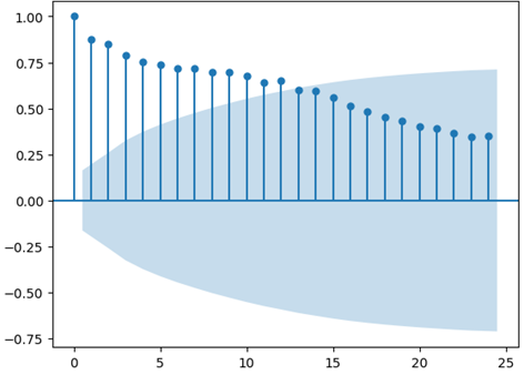
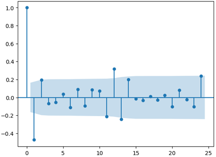
As an example, we created an autocorrelation plot of numbers of DASORs with a particular characteristic, presented in Figure 8. The plot shows how the number of DASORs at time t compares against time t-k, for different values of k. When k=0, we have a perfect correlation (as we are comparing a value with itself), but the correlation slowly decays as k increases – values further apart in time are less similar.
Figure 8: Example autocorrelation plot of numbers of DASORs with a similar characteristic.
A slow decay in correlation shows a general underlying trend (potentially an overall increase in activity). So, a simple method to remove this is to look at the first difference of the series (zt = yt – yt-1) and then look at the auto correlation of this instead; refer to Figure 9 for an example.
Figure 9: Example autocorrelation plot of first difference of numbers of DASORs with a similar characteristic.
This shows a marginal positive correlation at 12 months; if the plot had a large spike at 12 months, there would be cause for concern as this could imply there is a seasonal nature to incidents.
Given the wide range of options and DASOR fields that could be analysed over time, an automated means to detect changes was required. This would warn a human operator when the underlying trend is changing and that this pattern should be investigated. The “ruptures” Python package for change point detection was selected as it supports the Pruned Exact Linear Time (PELT) method, which is fast, given the requirement to attempt multiple analyses. The default PELT technique evaluates the squared deviation of a segment and, once it is above a threshold compared to previous values, notes a change point. It also supports a Radial Basis Function kernel to determine changes. An example plot is presented in Figure 10.
Figure 10: Example of automated change point detection in numbers of DASORS with a similar characteristic.
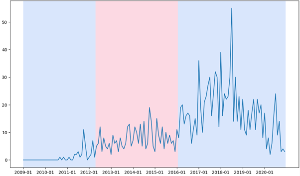
The colour changes represent a change point. So, with this example, this particular feature represented in DASORs has a change in 2012 and again in 2016. This could be because of a change in reporting requirements, equipment, usage or training. It is then over to a domain expert to confirm why the change occurred and recommend appropriate action.
5. The future
The project evaluated techniques that could be applied to the Royal Air Force’s (RAF) Defence Air Safety Occurrence Report (DASOR) dataset and showed the potential in using recent data science techniques. The challenge is to pass the knowledge to the RAF and enable them to take advantage of it. We focused on techniques that did not require specialist hardware or rely on unknown binary models to process the data. This enabled the RAF to recreate our work with minimal overhead.
The results were presented to Group Captains and other stakeholders in the RAF and Military Aviation Authority who were enthusiastic about the project and wanted to see how the proof-of-concept work could be taken forward. Longer term, the RAF needs more domain experts who are skilled in data science, and there are seven members of the RAF currently on the Graduate Data Science Programme. This will provide additional specialists who can take on the tools we created and develop and embed them. The next steps are to enable these tools to be used by domain experts without the data science skills; this could include wrapping the tools with a web frontend and hosting them in the RAF’s secure cloud provision. This would enable access at desk, on demand, without needing custom local installation, while retaining a secure store of both data and algorithms, removing the barrier to entry that would otherwise exist.
6. Authors
Gareth Clews, Duncan Elliott (Methodology and Quality Directorate, ONS), Ian Grimstead, Ryan Lewis (Data Science Campus, ONS) and Pete Kennedy (Royal Air Force)